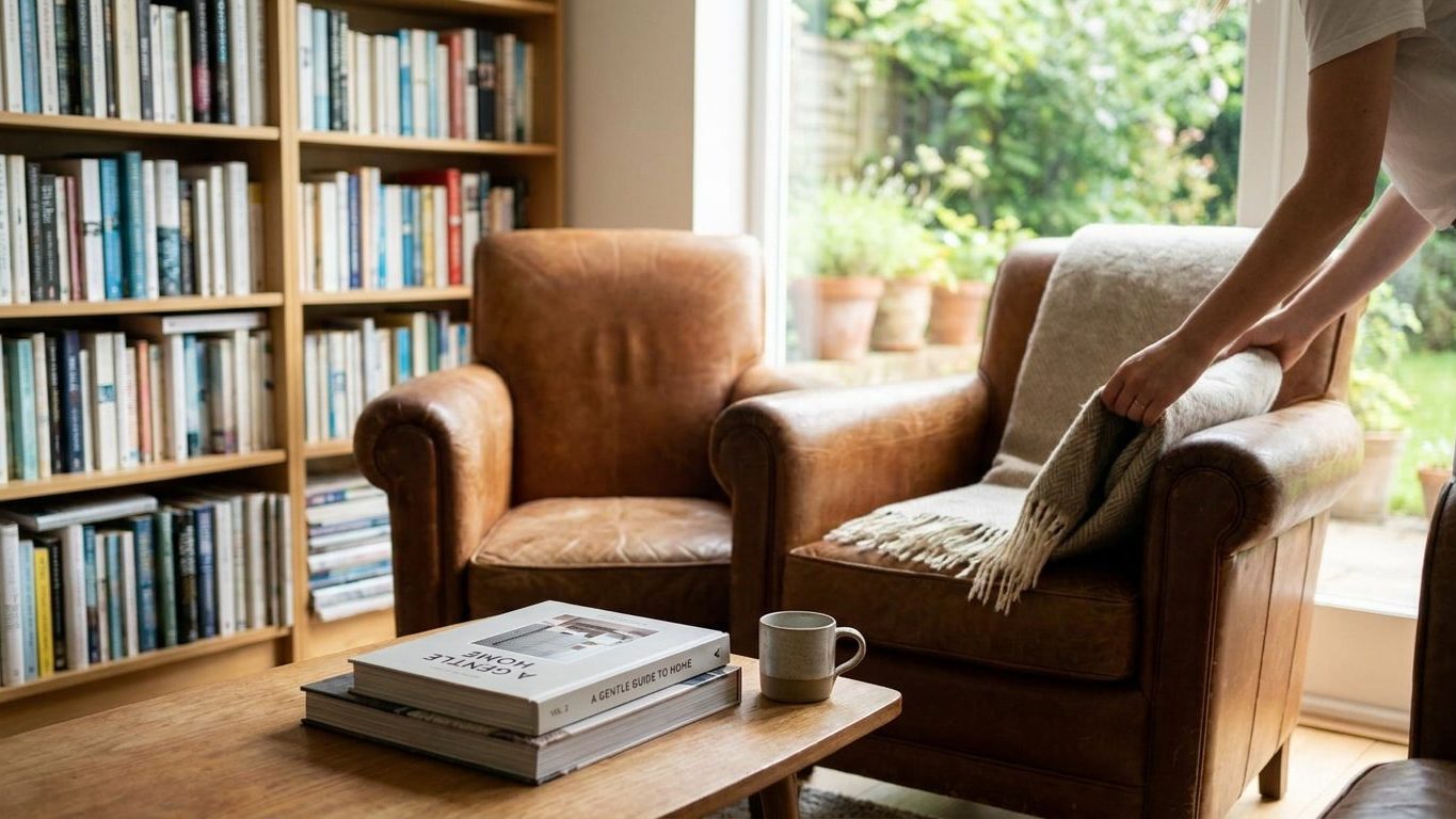

The empty middle of a room feels wrong, so the instinct is to push every chair and sofa flat against the walls and call the layout finished. That solves the emptiness but ignores how anyone actually gets from the door to the kitchen, the stairs, or a seat. Walk the room the way it gets used before you place a single piece, and build the arrangement around that route instead of around the walls.
What is actually going on

Every room has a fixed set of entry and exit points: doors, the foot of a staircase, an opening into a hallway or kitchen. People move between those points in close to a straight line, and that line is the room’s circulation path. It exists whether or not anyone plans for it. Furniture either respects that path or it doesn’t, and when it doesn’t, people end up walking around a couch, straight through a conversation grouping, or squeezing past a chair every time they cross the room.
Pushing every piece against the wall is the default because it feels efficient. It also creates a ring of furniture with an empty core in the middle, which forces every route through the room into that same wide, useless space. Two people trying to talk from opposite walls end up raising their voices or dragging a chair closer, because the seating was arranged to clear floor area rather than to hold a conversation.
A better approach treats a room as a set of zones rather than a set of walls. A seating group built for conversation, a dining table set up for eating, a reading chair with its own light: each of these is a destination, not a decoration. The circulation path should run between and around these zones, not through the middle of one. Once you know where people actually enter a room and where they head once inside, furniture can hold the space it uses and leave the rest of the floor free for walking.
A room with two doorways, a kitchen open to a living area for example, usually has two distinct paths crossing it, and one arrangement has to accommodate both without forcing either path to double as a seating boundary. This is where the wall-hugging default fails hardest, because it treats every doorway as equally important when in practice one gets used constantly and the other only occasionally.
None of this is a rule of physics. Nothing stops a household from putting a sofa in the middle of a large room, and in an open-plan space that is often exactly the right move, since it can define a living zone without needing a wall at all. This is a convention, not a fixed requirement, and what actually matters is not distance from the wall but whether the arrangement matches how the room gets used.
Doing it
Work out the paths before touching any furniture, check the clearances that matter, and test the plan without lifting anything heavy.
- Walk the room as it actually gets used. Note every doorway, and where people naturally head once they’ve come through it, toward a window, a fireplace, a television, a counter. Skip this and the layout gets designed around the room’s shape instead of its function, which is why so many arrangements look fine on paper and feel wrong once lived in.
- Mark the paths on the floor. Painter’s tape works, or a length of string held down with books at the corners. Skip this and it’s easy to underestimate how wide a walking route needs to feel, especially at a doorway where a door has to swing fully open without catching on anything.
- Group furniture by activity, not by wall. A sofa and two chairs angled toward each other around a coffee table make a conversation group regardless of where the walls happen to sit. Skip this and pieces end up scattered at even intervals around the perimeter, technically out of the way but serving no single purpose well.
- Check the pinch points. These are the narrow spots: the gap between a coffee table and a sofa, the space in front of a chest of drawers, the swing radius of a cabinet or closet door. Skip this and a piece that looked fine on a rough sketch turns out to block a drawer from opening more than halfway.
- Mock up the plan with what’s already on hand. Cardboard boxes, cushions, or the actual furniture shifted a short distance stand in for a full layout before anything gets carried up a staircase or dragged across a floor that scratches. Skip this and the first real test of the arrangement is also the last, with the heaviest piece already sitting where it turns out not to belong.
- Live with it for a few days before calling it final. Walk the room at the times it actually gets used: evening traffic toward a kitchen, morning traffic toward a bathroom. Adjust based on where feet actually land rather than where the plan assumed they would. Skip this and small misjudgments get corrected one at a time, months apart, instead of all together.
What it looks like when it goes wrong
Some failures here are simply awkward. Others are genuine safety problems, and the two call for different responses.
Awkward, not dangerous
A conversation group set too far apart forces people to raise their voices or lean in to be heard. That’s correctable by pulling the seating closer together, no new furniture required. A coffee table placed out of reach of the seating it’s meant to serve is the same kind of problem, fixed by moving the table rather than replacing it. A rug too small for the furniture sitting on it, so every piece appears to float off its edges, is different: that has to be replaced with a properly sized rug, because no amount of repositioning changes the rug’s dimensions.
A traffic path that cuts diagonally through the middle of a seating group instead of around it is usually correctable by rotating the whole cluster to close off the shortcut, sometimes by adding a low piece like an ottoman that discourages cutting through without physically blocking anyone.
Safety, not just appearance
Furniture that narrows a doorway or hallway leading to an exit is a safety issue, not a style one, particularly in a household that includes anyone using a cane or walker, or small children who trip over things left in a walking path. This has to be redone rather than tolerated, since the whole point of that route is to stay clear in an emergency, not just in daily use.
A tall, top-heavy piece such as a bookcase or media unit placed next to something climbable, like a low table or open drawer front, creates a tip-over risk in any home with young children. That risk exists independent of where the piece sits in the room, and it should be addressed by anchoring the piece to the wall regardless of the layout decision. A piece placed directly against a heat source such as a radiator or a floor vent can also restrict airflow or scorch fabric over time, which is worth catching during the same walk-through rather than after the fact.
What to settle first
Furniture layout stops being just a floor question the moment a piece needs to attach to a wall: a television bracket, a floating shelf above a console, a mirror hung over a low dresser. Before any of that gets fixed in place, settle what the wall actually is behind the surface, since drywall, plaster, and masonry all hold weight differently and a bracket rated for one may not be safe on another.
Settle what’s running inside that wall before drilling anything. Wiring, plumbing, and structural framing all sit behind a painted surface with no visible clue, and a general sense of the layout is a separate question from what The Places in a Wall You Must Not Drill actually names as off-limits, so it’s worth checking that list before committing to a spot chosen purely for how the room flows.
Whether the load belongs on that wall at all
Not every wall in a room is built to carry a mounted television or a loaded shelf, and a wall that looks solid from the front can still be the wrong choice once you know what’s framed behind it. If the arrangement depends on getting that decision right, treat it as its own task rather than an afterthought to the furniture plan, covered in full in Hanging, Shelving and Fixing: The Wall Decides.
Once a piece is up, it also has to sit level, and a wall that’s slightly out of plumb, which is common in older houses, can throw off a bracket or shelf even when it was installed correctly. Getting Things Level on a Wall That Is Not covers how to check for that before it becomes obvious to every guest who walks in.
Common questions
Do I really need to leave a walkway through every room?
Yes, in any room with more than one entry or exit point, because otherwise people cut through seating areas or squeeze past furniture on a daily basis. A room with only one doorway and no through-traffic has more flexibility, since nobody needs to cross it to reach somewhere else.
What if the room is too small for a proper conversation area?
Scale the seating group down rather than skipping it: two chairs and a small side table can hold the same function as a full three-piece sofa arrangement. A cramped room usually fails because the furniture is sized for a bigger space, not because a conversation zone can’t fit at all.
Does the TV have to face the main seating directly?
That’s a matter of preference rather than a fixed rule, and plenty of layouts angle seating toward a fireplace or a window instead. Where a television does anchor the room, the usual approach is to treat it the same as any other activity zone: keep sightlines clear and keep the walking path outside it.
Can furniture sit in the middle of a small room without blocking everything?
It can, as long as its footprint is small enough to leave a clear path around at least two sides, which is easier with a low piece like an ottoman or a slim console than with a full sofa. In a genuinely small room, furniture floating away from the walls often eats the exact space the walkway needs, so measure the path first.