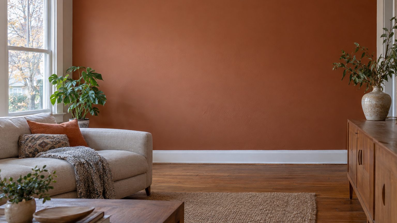

Paint that reads as warm oatmeal under store lights can turn into damp cement on a north-facing wall. The usual advice is “go lighter,” and it usually backfires. What works is choosing colors with a warm undertone built in, or committing to a deep shade that uses the dim light instead of fighting it. Cool, pale grays and blue-leaning whites are the colors most likely to disappoint.
Why north light pushes every color toward blue
A north window in the contiguous United States gets almost no direct sun. The exception is near the summer solstice, when the sun rises and sets slightly north of due east and west and can graze the glass for a short time. The rest of the year, the light in the room is sky light, bounced and scattered, and sky light skews blue. An overcast sky is commonly described as roughly 6500K on the color temperature scale, and a clear northern sky often reads higher. A standard warm household bulb sits around 2700K.
Paint only reflects the wavelengths that reach it. When the light is short on warm reds and yellows, a wall has less warmth to send back to your eye. A beige with a hint of green becomes greener. A gray with a trace of blue becomes noticeably bluer. A white with no warmth at all starts to look like the inside of a refrigerator.
Brightness is the other half. North rooms are simply dimmer, and the shortage is worse in winter. Minneapolis gets under nine hours of daylight around the winter solstice, and the sun sits low in the sky even at noon. In the Pacific Northwest, weeks of cloud cover make north rooms look even grayer. If you have ever repainted a living room in January and disliked it in March (or the reverse), season is part of the story.
There is a quieter advantage, though. North light is steady. It does not swing from golden at 8 a.m. to harsh at 2 p.m. to orange at dusk the way light does in other orientations. What you see at breakfast is close to what you see at 4 p.m., just dimmer or brighter. That makes a sample easier to judge. A South-Facing Room Warms and Bleaches at the Same Time, which is the opposite problem: lots of light that changes character by the hour.
What lies outside the window matters too. A north window that looks onto a shaded yard, a gray fence, or the side of a neighboring house will deepen the cool cast. Evergreens or a lawn can add a faint green reflection. Before you pick anything, stand in the room and note what the window actually shows you.
Colors that hold up in a north-facing room
Start with undertone, because it does more work than depth. Paint companies build every color on a base, and the base decides which way the color drifts. In a north room you want the drift to go warm. That means yellow, red, or brown underneath, and it applies to whites and grays as much as to reds and oranges.
Warm whites, creams, and soft neutrals
A white with a creamy, slightly yellow or pinkish base is the safest choice for a room that gets little direct light. Stark whites with a blue or neutral base tend to look gray here, and gray in a dim room looks like dirt. Most paint makers publish a light reflectance value (LRV) for each color, a number from 0 (absorbs everything) to 100 (reflects everything). Whites often fall in the 80s. You will usually find it on the back of the paint chip or on the manufacturer’s website. A high LRV helps a little, but it will not rescue a white with the wrong undertone.
Greige and taupe work better than pure gray for the same reason. A gray with brown in it will cool down under north light and land somewhere comfortable. A gray with blue in it will keep going. If you love gray, pick one that looks almost beige on the chip, then confirm it on the wall.
Soft yellows, blush, clay, and olive greens
Butter yellow, pale apricot, blush, and clay tones are underused in north rooms, mostly because people assume they will look too sweet. They rarely do. The blue in the light neutralizes some of their saturation, so a color that seems sugary on the chip comes out balanced. Greens with a yellow base, like olive or moss, hold their warmth, while blue-greens such as seafoam or spa tones move toward icy.
One rule of thumb: if the color on the chip already looks slightly warmer than you want, it will probably look right in the room.
Going deep instead
The other option is to stop trying to make the room feel sunny. Deep navy, forest green, charcoal, aubergine, and rich brown all look intentional in low light, because they are supposed to look moody. A pale color in a dim room looks like it failed. A dark one looks like a decision. Paint with an LRV under about 20 will make the room feel enclosed by day, but it also hides the shadow gradients that make a north room look dingy, and it glows in the evening under lamps.
Dark colors suit spaces you use mostly after work: a den, a dining room, a bedroom, a home office where you work with the lights on anyway. They are a harder sell in a small hallway or a windowless nook, where you may want every bit of reflected light you can get.
Colors that go wrong, and why
Cool grays top the list. A gray labeled “light” or “airy” may have a pleasing LRV and still turn slate blue by mid-morning. Blue-grays, periwinkles, lavenders, and icy greens go the same way, since they start cool and the light adds more. Pure or “bright” white is the sneakiest, because it feels safe. In a north room it can look flat and faintly blue, especially next to cream-colored trim or a warm wood floor.
Pairing matters. If your floor is a gray-toned laminate or a cool-brown tile, warm walls will make the floor look colder, not warmer. That is often fine, but it should be a choice, not a surprise. Matching Paint to a Floor You Are Not Replacing walks through how to read a floor’s undertone before the paint can goes on the wall.
Sheen also changes the picture. Flat paint scatters light and hides wall flaws, but it reflects less of the little light a north room has. Eggshell or satin bounces slightly more. The trade-off is that glossier finishes show roller marks and patched drywall. A common approach is eggshell on walls, flat on the ceiling, and satin on trim, with the ceiling in a white that matches the warmth of the wall color rather than a blue-white that clashes with it.
Overcorrecting is another trap. Painting a north room in saturated orange or yellow to “make up for” the missing sun usually gives you a color that looks fine at noon and garish at night. Warm, not loud, is the goal. A color with some gray or brown in it will still look warm under north light while staying easy to live with.
How to test and light the room before you commit
Never judge north-room paint from a 2-inch chip. Small samples are read against whatever surrounds them, and in a dim room your eye fills in the missing warmth. The method below takes about three days and costs less than a gallon of the wrong color.
- Paint two coats on a board or poster paper at least 2 feet square, or use large peel-and-stick samples, and leave a white border around the color so the wall does not skew your read.
- Tape one sample on the wall facing the window and another on the wall beside it. The same color changes between them because the light hits at different angles.
- Look at both in the morning, midday, and evening, and again with the lamps on after dark.
- Next to the sample, hold anything that will stay in the room: a sofa cushion, a curtain swatch, a flooring offcut. Color is relative, and the sample has to live with these things.
Pay special attention to the sample under cloud cover and in the evening. Those are the two moments when a north room reveals its true colors.
Light bulbs deserve the same attention as the paint. Many households run a mix of cool and warm bulbs without noticing, and in a north room the difference is obvious. In the US, packaged bulbs carry a Lighting Facts label that lists color temperature in kelvins. For a room that already skews blue by day, 2700K to 3000K bulbs bring balance after dark. A color rendering index (CRI) of 90 or higher makes paint look more like it does in daylight. Several lamps at different heights usually do more for a dim room than one overhead fixture, and wall washers or a lamp aimed at the ceiling add the sense of height north rooms often lack.
A mirror placed opposite the window picks up the sky and throws it back into the room. White or light-colored curtains hung wide of the frame, so the glass stays fully uncovered, keep every bit of daylight available. These are small moves, but in a room with one source of light each one counts.
One last nuance: north rooms change with the calendar more than people expect. In states like Vermont, Michigan, or Washington, a maple or alder outside the window filters light through green leaves in July and lets in bare gray sky in January. A sample that looks right in the middle of summer may look cooler in winter. If you can, leave your final candidate up for a few weeks, and check it once more on the first overcast day of the season you spend the most time in that room.
For more room-by-room color guidance, see the Decor section.