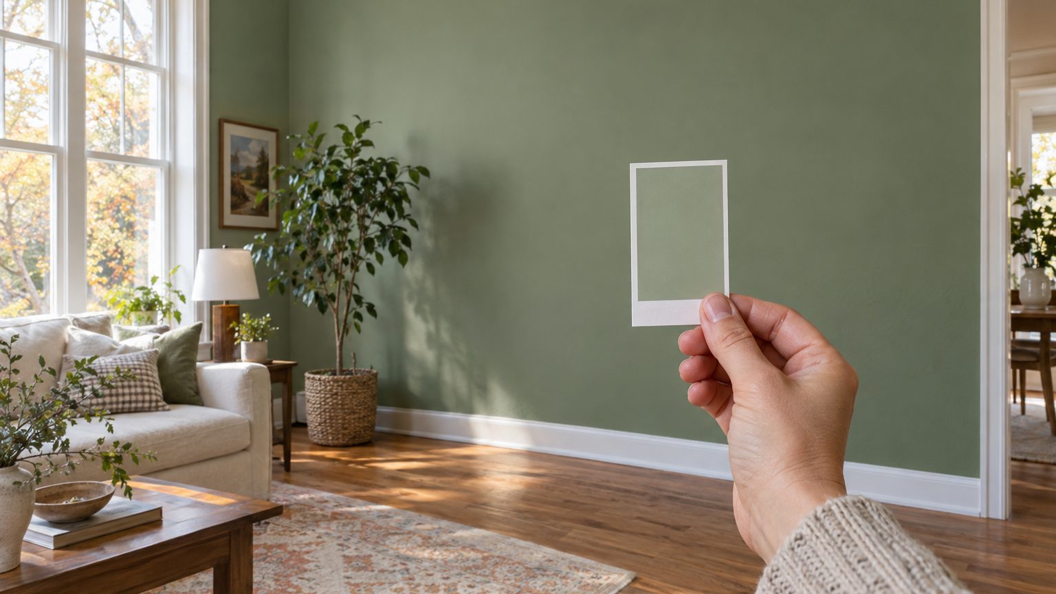

The chip and the wall are two different objects viewed under two different conditions, so they rarely match. A chip is a small printed rectangle seen against white paper in store lighting. A wall is a large, vertical, textured surface lit from one direction, tinted by everything near it, and judged by eyes that have already adjusted to the room. Size, light, surroundings, sheen, and the person looking each move the color a little. Together they can move it a lot.
That doesn’t mean the chip lied. The ink on the card is usually a fair representation of the paint’s color under standard conditions. Your living room just isn’t standard conditions, and neither is anyone’s.
The chip is a different kind of object
Start with scale. A typical paint chip measures roughly 2 by 3 inches, about 6 square inches of color. The walls of a 12-by-12-foot room with 8-foot ceilings run close to 380 square feet before you subtract doors and windows. That’s a ratio somewhere around 1 to 9,000. You are extrapolating from a postage stamp to a barn door.
Scale matters because large fields of color look more intense than small ones. A mid-tone sage that reads as quiet and gray on the chip can turn distinctly green once it covers four walls, and a soft blue can read as icier. Designers often describe this as the color “coming forward.” The practical rule is to assume the wall will look a bit deeper and more saturated than the chip suggested, and to pick one step lighter on the card if you want a gentler result.
Then there’s the border. Nearly every chip sits inside a white or off-white margin, and your eye judges the color against that frame. This is simultaneous contrast, a well-documented quirk of vision: the same gray looks lighter against a dark surround and darker against a light one. On the wall, the frame disappears. The color now sits next to trim, ceiling, flooring, and whatever else is in the room, and the comparison changes completely.
The material is different too. The chip is ink printed on card stock, usually with a matte or lightly coated surface. The wall is a pigmented film with its own sheen, and it may be rolled over texture or an older color. The two can be matched closely by the manufacturer, but they are never physically identical. And if you picked the color on a phone or laptop, you were looking at light emitted from a screen, which depends on brightness settings and display calibration. A screen can get you to a neighborhood. It cannot give you the address.
Light rewrites the color before it reaches your eye
You never see paint. You see light bounced off paint. Change the light and you change the color, and indoor light varies more than most people realize.
Three measurements matter. The first is color temperature, given in kelvins. Older-style warm bulbs sit around 2700K and push everything toward yellow and orange. Bulbs labeled “daylight” run 5000K to 6500K and lean blue-white. A greige that looks creamy under a 2700K lamp can look cool and slightly gray at 5000K. The second is the color rendering index, or CRI, a 0 to 100 scale of how faithfully a bulb shows colors compared with a reference source. Many budget LEDs land in the 80s, and bulbs rated 90 or higher render paint colors more honestly. The third is the daylight itself, which changes by direction, time of day, season, and region.
Direction is the biggest variable. North-facing rooms get steady, cool, indirect light, which tends to pull colors toward blue and gray and make them look flatter. South-facing rooms get strong light that swings from warm in the morning and evening to bright and washed-out at midday. That second case is complicated enough to deserve its own treatment, which is why A South-Facing Room Warms and Bleaches at the Same Time covers it in detail. East rooms are golden early and cool by afternoon, and west rooms do the opposite.
Geography adds another layer. A house in western Washington lives under frequent overcast skies, which produce soft, bluish, diffuse light for much of the year. A house in Arizona or New Mexico gets intense, high-angle sun that can bleach pale colors and make saturated ones look harder. In northern states such as Minnesota or Maine, the winter sun sits low and weak, so a room that glows in July can look dull and cool in January. The same can of paint will not behave the same way in all of these places.
There’s also a trick of vision called metamerism. Two colors can look identical under one light source and visibly different under another, because their pigments reflect light in different patterns. It’s the reason a trim color and a wall color that matched in the store can drift apart at home. It also explains why a color you approved at 2 p.m. looks off at 8 p.m. under lamps.
Light reflectance value, the number on the back of the card
Many manufacturers print or publish a light reflectance value, or LRV, for each color. It runs from 0 (absolute black) to 100 (perfect white) and tells you what share of the light hitting the surface bounces back. It’s the most underused number in paint shopping. A color with an LRV in the 70s will brighten a dim room and show off any undertone it has. One in the 10s or 20s will absorb most of the light and make a small room feel closed in, whatever it looks like on the chip. If two similar colors have very different LRVs, the one with the higher number will usually look lighter and clearer on the wall, even if the chips look close.
What the room does to the paint
Even with identical light, a room is full of influences that a card never meets. Reflected color is the sneakiest. A south-facing window that looks onto green lawn pours a green tint across a white wall. Red brick next door, a honey-toned oak floor, a rust-colored sofa, and a big maple outside the window all tint the light before it lands on the paint. A pale gray in a room with warm wood floors will pick up a creamy cast near the baseboard and look cooler near the ceiling. The wall isn’t one color; it’s a gradient.
Undertones are where many surprises begin. Most neutrals contain a hidden hue: grays lean blue, green, or purple, and beiges lean pink, yellow, or green. On a chip, held next to a true white sheet, the undertone shows. On the wall, it gets amplified by the light and by whatever’s nearby. A gray with a faint violet undertone can look lavender beside a warm beige carpet. If a color has to coexist with fixed elements such as flooring, countertops, or tile, hold the chip against those first. They are the things you can’t repaint.
Sheen is a separate lever, and the chip can’t show it at all. A flat finish scatters light and looks softer and deeper. A semi-gloss or gloss reflects more directly, so the color can look lighter at some angles and glaring at others, with window reflections skating across the surface. The same formula in two sheens can read as two colors, which is the subject of The Same Color in Two Finishes Is Two Colors. If your chip is a matte card and your plan is eggshell in a kitchen, expect a shift.
The surface underneath matters as well. A deep or strongly colored existing wall can show through a first coat and skew the result, particularly with lighter paints. Most manufacturers recommend two coats, and a tinted primer for dramatic changes. Judging a color after one thin coat is a common mistake, because you’re partly looking at the old paint.
Finally, there’s the viewer. Human vision adapts. After a few minutes in a room, your brain recalibrates to the dominant light, which is why a color that looked startling at first can look normal an hour later. A bedroom used mostly after dark should be judged under the lamps in it. A home office used at midday needs checking in daylight. The occupant’s age matters too, and that comes up again at the end.
A sampling routine that catches the surprises
The fix is boring and it works: test a large sample, in place, for several days. A few specifics make the test much more reliable.
- Paint a board or poster board at least 2 feet square, with two coats, rather than a patch on the wall. Leave a white border so the old wall color doesn’t contaminate your read.
- Move it around. Tape it to each wall, because the same sample looks different on the window wall and the opposite wall.
- Check morning, midday, late afternoon, and evening under the actual bulbs you use, with the lamps on and off.
- Set it next to the fixed items: flooring, cabinetry, trim, upholstery, a big piece of art.
Peel-and-stick samples, sold by several paint brands, skip the board-painting step and can be moved easily, though they’re still the same size problem on a smaller scale. Whichever format you choose, give the sample a full day to dry and settle before you decide. Wet latex paint often looks different from dry, and a verdict reached 20 minutes after painting is a verdict on the wrong color.
If two candidates both look good, the one with the more forgiving LRV and undertone for your light is usually the safer pick. And if you’re deciding between a gallon of the real thing and another round of samples, the samples are cheaper than repainting a room. That’s the general logic behind everything in this section of Decor: pick the color for the people and the light in the room, not for the card.
One last wrinkle that few color guides mention. The lens of the human eye gradually yellows with age, which dulls the perception of blues and violets and makes cool colors look grayer and darker. A soft blue-gray that looks crisp to a 30-year-old can look muddy to a 70-year-old living in the same room, so if an older family member is the main occupant, test the sample with their eyes, not yours.