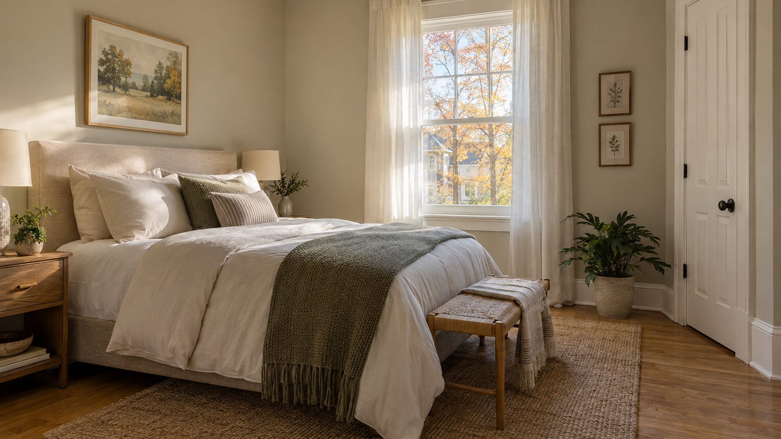

For most rooms, the safest trim paint color is a white that shares an undertone with the wall color, in a satin or semi-gloss sheen. That answer covers perhaps seven rooms out of ten. The other three call for a different move: painting trim the same color as the walls, or going darker than the walls on purpose. Which one fits depends on the light the room gets, the wall color, and who walks past that baseboard every day.
Trim is the least discussed decision in a paint project, and the most visible. Take a 12-by-14-foot bedroom. Its baseboard runs roughly 49 feet once you subtract the door, and at a typical 5¼ inches tall that comes to about 21 square feet of paint. The walls total more than 400. Trim is around 5 percent of the surface, yet it outlines every window, door, and floor edge in the room, and the eye reads those outlines first.
Three trim strategies, and what each one does to a room
White trim is the default for a reason. A crisp edge around a colored wall looks finished, and white reflects daylight into corners where walls tend to go dim. It also forgives a lot. If the wall color changes in five years, the trim stays put. The risk is a white that fights the wall. A cool, blue-leaning white beside a warm greige wall makes the wall look dingy, and a creamy white beside a cool gray makes the trim look yellowed, as if it had aged forty years overnight.
Tone-on-tone is the quieter option. You paint walls and trim the same color, then separate them by sheen: a flat or matte finish on the wall, satin or semi-gloss on the wood. The trim shows up as a soft shimmer instead of a stark outline. The effect works well in small rooms and bathrooms because the boundaries blur and the space reads as one volume. It also hides the sins of cheap builder-grade trim, with its wavy edges and uneven caulk lines. The tradeoff is that you lose the bright frame around windows, so a dark room can feel heavier than it needs to.
Contrast trim sits at the bold end. Think deep green trim against pale walls, or black window casings in an otherwise white room. Done well, it looks architectural, almost like a drawing. Done carelessly, it exposes every gap, every drip, every crooked miter, because dark gloss shows surface flaws that white hides. If you go this route, plan on extra prep time: filling nail holes, sanding, caulking seams, and priming.
Wood-toned trim is a fourth case that gets overlooked. In many mid-century and older homes, the original oak or fir casings are in good shape. Painting over them is a one-way decision in practice, since stripping paint from grained wood later is tedious work. If the wood is sound and the style suits the house, it can be the best trim color you have: it costs nothing and nobody can copy it.
Matching the white to the wall and the light
Paint companies sell dozens of whites for a reason. Every white carries a hidden undertone, whether blue, yellow, pink, green, or gray, and that undertone shows up once the white sits beside another color. The simplest rule: look at your wall color, decide whether it leans warm or cool, and pick a trim white that leans the same direction. Warm wall, warm white. Cool wall, cool white. A neutral wall can take almost anything.
A number on the paint chip or the manufacturer’s website helps here. Light reflectance value, or LRV, runs from 0 (absolute black) to 100 (a perfect reflector). Most popular trim whites land somewhere in the 80s. A white closer to 90 reads as bright and clean, while one in the high 70s starts to look soft and slightly dingy next to a white ceiling. The gap between wall and trim matters as much as the trim number itself. A wall at an LRV of 60 with trim at 85 gives a gentle but clear edge, and a wall at 80 with trim at 85 gives almost none.
Light direction changes the result more than most people expect. A north-facing room gets cool, steady, bluish light, and that light will pull any white toward gray. Warmer whites with a touch of yellow or cream counter it. South-facing rooms get warm, strong light for most of the day, so a white that looked neutral in the store can turn buttery by midafternoon, and a cooler white holds the balance. East rooms are warm in the morning and cool by afternoon. West rooms flip that, going golden at dusk. The practical way to check is to paint a sample on a board, not directly on the wall, and tape it against the trim at three times of day: morning, noon, and evening with the lamps on.
Lamps matter more than people think. The bulb temperature in the room, whether 2700K soft white or 5000K daylight, shifts how white trim reads at night. A room that looks right at noon can look sallow under warm bulbs. If the room is mostly used after dark, which is true of most bedrooms and dens, test the sample under the actual bulbs.
The ceiling counts too. Many painters use the same white on the ceiling and the trim, which makes the room feel taller and ties the top and bottom together. Others use a slightly warmer or cooler ceiling white and leave the trim as a separate element. Either approach works, but avoid putting a bright trim white against a visibly different ceiling white at the crown molding, where the two meet and the mismatch is easy to see.
Sheen, paint type, and the prep that makes it last
Trim takes a beating that walls do not: vacuum bumps, shoe scuffs, doorknob hands, pet claws, and the occasional wet mop. That is why semi-gloss became the traditional choice. A harder, shinier surface wipes clean more easily and resists scuffing better than flat paint. The downside is that gloss amplifies every imperfection, including brush marks, dents, and uneven caulk. Satin has become a popular compromise. It cleans nearly as well, looks softer, and forgives older, wavier wood. In a house with a lot of dings in the casings, satin is usually the kinder pick. Reserve high gloss for new, flawless trim or for a deliberate dramatic look.
Paint formulation matters as much as sheen. Traditional oil-based enamels level out beautifully and cure hard, but they yellow over time, take a long time to dry, and carry heavy solvent odors. Many states restrict their VOC levels, with California among the strictest, and in some areas the old-style formulas are hard to find. Modern waterborne enamels, including acrylic-alkyd hybrids, are designed to level smoothly and stay white, and most DIYers should start there. Check the can: trim paint is labeled “enamel” for a reason, since it is formulated to dry to a harder film than wall paint.
Dry is not the same as cured. Trim enamel can feel dry within hours, but it may take two to four weeks to reach full hardness, depending on the product, temperature, and humidity. During that window, it is easy to dent with a vacuum head or a stuck-on piece of tape. Remove painter’s tape once the paint is dry to the touch, not fully hard, and score the edge with a blade first so you do not peel a strip of fresh enamel off with it. For a single room, a quart typically covers the trim. One quart spreads over roughly 100 square feet per coat, which is more than enough for baseboards and casings in a bedroom.
If the house was built before 1978
Older trim often carries lead-based paint under later coats. Sanding it dry creates dust that is hazardous, especially for children and pregnant women. The EPA’s Renovation, Repair and Painting rule requires certified lead-safe practices from contractors working in pre-1978 housing, and homeowners doing their own work are wise to follow the same habits: test first with a kit, wet-scrape instead of dry-sand, and keep dust contained. If the trim is intact and the existing paint is not peeling, cleaning, scuff-sanding wet, priming, and recoating is often safer than stripping.
Trim by who uses the room
Because this series sorts color by occupant and light, the people in the room should steer the trim as much as the wall color does. A kid’s room is a durability problem first. Scuffs at baseboard height are inevitable, so semi-gloss or a washable satin in a white slightly warmer than stark pure white will hide marks better and clean easily. Pick a trim color you can touch up without repainting the whole run, and keep a labeled jar of the leftover.
Rooms for older adults raise a different issue: visibility. People with reduced vision often rely on contrast to see where a door opening or a baseboard begins. Accessibility guidance for low-vision design commonly suggests a clear difference in light reflectance between adjacent surfaces, often cited at around 30 LRV points, between doorframes and walls or between baseboards and floors. A soft gray wall with bright white casings does that job better than tone-on-tone ever could. In this situation the practical choice also happens to look sharp.
Guest rooms and rentals lean the other way. The goal there is calm and flexibility, so a neutral white trim that goes with nearly any bedding is the right call. The reasoning in A Guest Room Is the One Room You Do Not Live In applies directly: a room people visit briefly benefits from restraint, and trim is where that restraint shows. Likewise, if you are weighing a bold wall, the question of trim comes along with it. The advice in Does an Accent Wall Still Work, and Which Wall? pairs well with this one, because an accent wall needs a trim white that holds its own beside a saturated color. For more on how color decisions fit together across a house, the Decor section collects the rest of the series.
One small detail catches many people at the finish line: the inside of a door. Doors are usually painted the same sheen as the casings, but they do not have to match the trim color. In a hallway lined with doors, painting them a slightly deeper shade than the casings, even just a step or two down the same paint strip, keeps the passage from reading as a row of white rectangles. Painters sometimes forget the door edges and hinge side, so check those before the final coat, since that is the part of the door that is hardest to touch up once it is hung.