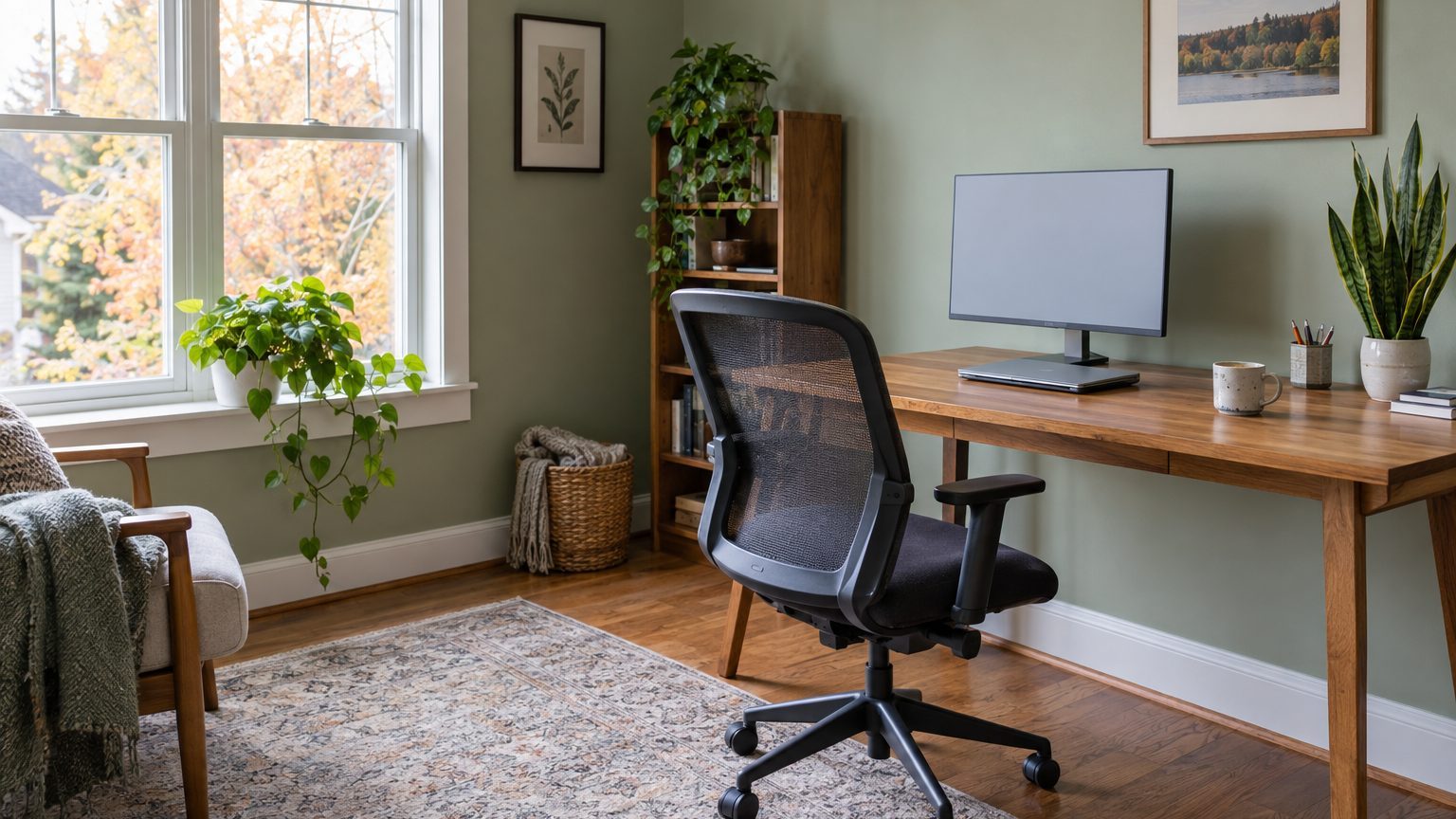

For a room where you’ll spend eight hours a day, pick a mid-tone color with some gray in it, such as sage, soft blue-green, dusty blue, or warm greige. Put it on the walls in a matte or flat finish, and aim for a light reflectance value (LRV) somewhere between 40 and 60. Those choices fit most home office paint colors decisions because they avoid the two things that wear you down at a desk: glare and harsh contrast with your screen. The right shade within that range depends on which way your window faces and where your monitor sits.
What eight hours at a desk does to a color
A living room color gets judged in passing. An office color gets stared at, usually from the same seat, at the same angle, under the same lamp. Small irritations compound. A wall that’s a touch too bright, a gray that turns blue at 3 p.m., a yellow that reads like a legal pad: none of these bother you on day one. By week three, you notice you’re squinting.
The most useful number on a paint chip is the LRV, which runs from 0 (absorbs all light) to 100 (reflects all of it). Most brands print it on the back of the chip or list it on the product page. Bright whites often land in the 80s. A medium sage might sit in the 40s or 50s. Deep navy or charcoal falls below 10. Workplace lighting guidance generally favors ceilings that are very reflective and walls in the middle of the range, roughly 40 to 60 percent, because walls much brighter than a screen create glare and walls much darker make the screen look harsh against its surroundings.
That second problem catches people off guard. A bright monitor against a near-black wall forces your eyes to keep adjusting between two very different brightness levels. Dark rooms can look wonderful, and plenty of people work happily in deep green or ink blue, but they need good ambient lighting so the screen isn’t the only bright thing in view. If the room has one small window and a single overhead fixture, skip the dark palette.
Saturation matters as much as lightness. A strongly saturated color, whether it’s tomato red, school-bus yellow, or electric teal, asks more of your eyes over time and bounces its tint onto your skin, your paperwork, and your face on camera. Research on color and mood in work settings has produced mixed, modest results, so I wouldn’t trust anyone promising that blue makes you focused or red makes you productive. The practical argument is simpler: muted colors fade into the background, which is exactly what you want from a wall when your attention belongs on a spreadsheet.
Finish plays a quiet role too. Flat and matte paint scatters light instead of mirroring it, so a window or a desk lamp doesn’t leave a bright streak across the wall. Eggshell works if you need to wipe scuffs, though it will show a faint sheen at an angle. Save satin and semi-gloss for trim and doors.
Colors that hold up, and the light they need
No single color works in every office, because the same paint changes with the light it’s sitting in. A room facing north gets cool, steady, bluish light all day, while a south-facing room gets strong light that shifts from warm to neutral. East and west rooms swing the most. Think of your window as a second paint ingredient you don’t control.
North-facing rooms
Cool light pulls blue and gray out of any paint, so a pale gray that looked neutral in the store can turn flat and chilly at your desk. Warm-leaning mid-tones do better here: a greige with a touch of yellow, a soft olive-leaning green, a clay-tinted neutral. We covered this in more depth in A North-Facing Room Cools Every Color You Put In It, including why chasing a bright white in that exposure usually backfires. Since north light is even and low in glare, you can often go a step deeper in lightness than you would in a sunnier room.
South, east, and west exposures
South-facing offices have light to spare, which makes them forgiving. Cooler colors like dusty blue, blue-green, and gray-green look clean instead of cold, and a very pale wall can get blinding by early afternoon, so lean toward the middle of that 40 to 60 LRV range instead of the top. East-facing rooms are warm and golden in the morning, then turn cool and flat after lunch. A balanced neutral with no strong undertone tends to survive both halves of the day. West-facing rooms are the toughest for screen work, since low, orange sunlight arrives around 4 p.m. and floods the wall. Soft greens and muted blues counteract that warmth, and blinds that can be angled do more for your eyes than any paint swap.
Window position relative to the monitor matters more than the wall color itself. The standard ergonomic advice is to set the screen perpendicular to the window, so daylight comes from the side instead of straight into your eyes or onto the screen. If your desk faces a window, a darker wall behind you and a matte surface on the monitor side won’t fix the problem, but a sheer shade will.
A few color families come up again and again in offices that people actually like working in:
- Gray-green or sage: calm, forgiving in most light, flatters wood and houseplants.
- Dusty or gray-blue: works best in south and west rooms, where there’s enough warmth to keep it from feeling cold.
- Warm greige or mushroom: the safe choice for north and east light, and it pairs with almost any furniture.
- Soft terracotta or clay beige: a warmer, more social option for people who find cool colors sterile.
Stark builder white sits at the other end. It can work if you have plenty of daylight and a dark desk, but in many offices it ends up glaring in the morning and gray by evening. If you love a white wall, choose one with a visible tint and an LRV in the mid-70s or lower, not the brightest option on the rack.
The wall behind you versus the wall you face
Most people paint every wall the same color and stop thinking. An office has two jobs for its walls, though, and they don’t always want the same color. The wall in your field of view should be calm. The wall behind you is the one that shows up on every video call, which makes it the one that deserves a second look.
Webcams adjust exposure automatically, and a large expanse of bright white behind you can push the camera to darken your face to compensate. A mid-tone backdrop, say a gray-green or a warm greige, gives the camera an easier average to work with and tends to make skin look more natural. Very saturated walls can cast a color tint onto your face, which is why a bold orange accent can leave you looking faintly sunburned on screen. A matte finish helps again here, since a glossy wall can show a bright reflection of your ring light or window.
That split is a good reason to use two colors, with the camera wall deeper or more colorful and the others lighter and quieter. The trick is keeping them related so the room reads as one space, and Two Colors in One Room Without It Looking Like Two Rooms walks through how to do it with shared undertones and a deliberate break point. In a small office, the simplest version is painting just the wall behind the desk a shade or two deeper than the rest.
If the office is a corner of a bedroom or living room, color can also mark the boundary. A slightly deeper shade on the wall around the desk tells your brain where work happens, and it makes closing the laptop feel more like leaving a room. This matters for people who work from home full time, where the line between “at work” and “at home” tends to blur by default. Browse more room-by-room ideas in the Decor section if you’re colorizing more than one space.
Testing before you commit
Paint chips lie, politely. A 2-inch square under store lighting tells you little about a full wall at your actual desk. Use a sample pot, or large peel-and-stick samples, and put at least two swatches of about 12 inches square on different walls: one near the window and one in the darkest corner. Leave them up for several days.
Check them at three times: mid-morning, early afternoon, and the hour you usually finish work. Look at them while sitting in your chair, because standing at the wall changes the angle and the glare. If you take video calls, open your camera app and see what the swatch looks like through it, since cameras interpret color differently than your eyes do.
Your bulbs matter as much as your paint. Warm bulbs around 2700K to 3000K make most colors richer and a little yellower, while 4000K or higher reads crisp and bluish, which can make a gray-green look cold and clinical. Many people prefer something in between for a workspace, with the brightest, more neutral light on the task area and softer light elsewhere. If color accuracy matters because you do design, photo editing, or similar work, look for bulbs with a color rendering index (CRI) of 90 or higher, so the colors on the wall and on your screen aren’t fighting each other.
Renters don’t have to give up on all this. Large removable wall decals, a painted piece of plywood or canvas leaned behind the desk, or even a fabric panel can create the camera backdrop without touching the lease. Check the lease before painting any walls, since many landlords require repainting to the original color when you leave.
One last detail about those samples: wet paint looks darker and often slightly different in hue than dry paint, and some colors keep shifting slightly for a day or more as the film cures. Judge the swatch after it has dried fully, not an hour after you brushed it on, and you’ll avoid a surprising number of repaints.