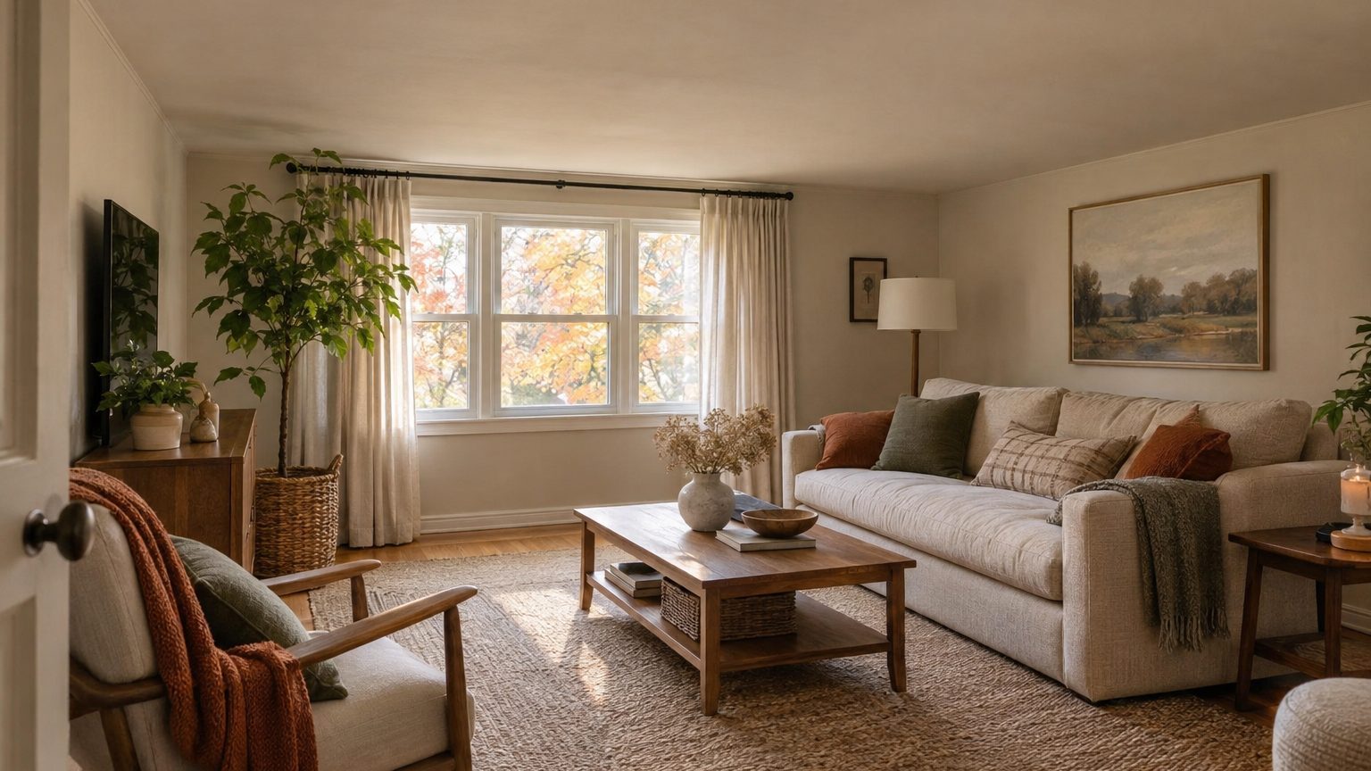

The ceiling line, the place where wall color gives way to ceiling color, does more for a low room than the color on either side of it. A 7-foot-6-inch ceiling painted a perfect pale tone can still feel like a lid if a hard, high-contrast edge runs around the top of the walls. The same ceiling can feel taller than its measurements when that edge is softened, moved, or erased. So the practical answer on low ceiling paint color: choose a light, low-contrast color, then decide deliberately where it ends.
Most advice stops at “go light.” That’s fine as far as it goes. It just leaves out the part where a lot of people end up disappointed, because they picked a pale color and a stark white ceiling and got a room that still felt squat.
Why the edge reads as the height
Your eye doesn’t measure a room with a tape. It finds the strongest boundary at the top of the walls and treats that as the ceiling. Where the contrast is sharp, as with deep green walls under white paint, the boundary is easy to spot and the height feels fixed. Where the wall and ceiling are close in tone, the boundary dissolves and the eye has nothing to stop on.
That’s the whole principle, and it explains several things that otherwise seem like contradictory rules. It explains why a white ceiling over white walls can feel taller than a white ceiling over mid-tone walls. It also explains why a thick, dark crown molding on a low ceiling makes the room look compressed, since it draws a heavy horizontal line right where you least want one.
Low, in this context, generally means under 8 feet. That covers a lot of American housing. Eight feet is the common standard in postwar and newer construction, but many older homes, Cape Cods, ranches with dropped ceilings, and finished basements come in at 7 feet 6 inches or less. The model building code most states build on (the International Residential Code) sets a 7-foot minimum for habitable rooms, with allowances for beams and ducts. A room that technically passes can still feel tight.
Four places to stop the color
You have more options than “walls one color, ceiling white.” Each placement of the line changes how the room reads, and some suit certain houses better than others.
At the corner, with a soft contrast
This is the standard approach: wall color stops at the ceiling corner, and a flat white goes overhead. It works best when the wall color is light enough that the jump to white is gentle. Think warm cream under bright white, or a pale gray-green under a slightly warmer white. If the wall color is mid-tone or darker, the jump gets loud and the ceiling seems to float lower.
One small trick helps here. Skip stark builder white and pick a ceiling white that leans toward the wall color’s undertone. The edge softens without disappearing, and the ceiling still reads as a bright surface above you.
Carrying the wall color across the ceiling
Designers often call this color drenching. Walls, trim, and ceiling all get the same color, sometimes in different sheens. With no contrast line, there’s no edge for the eye to catch, and the room reads as a single volume instead of a box with a lid.
It works well with light and medium-light colors in low rooms, and it’s the best fix I know of for a ceiling that’s uneven or has awkward soffits. The catch: drenching in a dark color needs real light. In a dim room with 7-foot ceilings, deep colors can feel cave-like, and you’ll want to be honest about how much daylight you actually get. Our guide to a finished basement as a room with borrowed light goes deeper on that tradeoff.
Bringing the ceiling color down the wall
Some painters carry the ceiling white 4 to 8 inches down the wall and finish with a crisp line. The idea is to lift the apparent boundary so the walls look taller. Designers are split on it. When the wall is a pale color and the line is razor-clean, it can add a sense of height. When the line wobbles, which it will on old plaster or slightly bowed drywall, it highlights every flaw and looks like a mistake.
Use this one only if you’re willing to tape carefully and measure the line with a level or laser, not by eye. A band that runs even 1/4 inch off across a 12-foot wall will register.
Blurring the edge with a gradient
Less common but worth knowing: a gentle fade where the wall color lightens toward the ceiling. It’s labor-intensive and easy to botch, so most homeowners should skip it. The same effect comes more cheaply from choosing a wall color with a high light reflectance value and letting a lit ceiling do the work.
What color, then, once you know where it stops
With the edge decision made, color selection gets easier. Light reflectance value, or LRV, is a 0 to 100 scale printed on most paint chips and on manufacturer websites, where 0 is absolute black and 100 is a perfect reflector. Ceiling whites often land above 80. For walls in a low room, staying somewhere in the 60s or 70s keeps the contrast with the ceiling small and lets the room bounce light instead of absorbing it.
That doesn’t mean white walls only. A soft sage, a pale blue-gray, a warm greige, or a sandy cream can all sit in that range. What matters is that the wall color isn’t doing the opposite job of the ceiling.
Temperature matters too, though less than people think. Cool tones such as pale blue and gray-green tend to recede, which helps a ceiling feel farther away. Warm tones advance, so a saturated warm color on the walls pulls the whole room in. That’s not a ban on warm colors. A buttery cream is warm and still reads light. It’s a reason to be cautious with terracotta or mustard in a room under 8 feet.
And sample before you commit. Paint a large piece of poster board or a 2-by-2-foot patch and look at it in the morning, at midday, and with the lights on at night. A color that looks open in noon sun can turn muddy under warm lamps. In low rooms, the ceiling usually gets less direct light than the walls, so it often looks a shade darker than the can promises.
Sheen is part of the color
Flat, or matte, ceiling paint is the default for good reason. It scatters light evenly and hides roller marks and drywall seams. Moving up to eggshell or satin on a ceiling increases reflectivity, which sounds helpful in a low room, but it also reveals every imperfection, and light raking across a glossy surface highlights seams you’d never otherwise notice. Unless the drywall finish is excellent, stay with flat on the ceiling.
Walls can go a notch higher. Eggshell on the walls with flat overhead gives you a subtle reflectance difference that keeps the ceiling feeling like its own plane without needing a stark color contrast.
Everything else that moves the line
Paint isn’t the only thing drawing a boundary at the top of your walls. A few other details can undo a good color choice.
Crown molding is the classic example. A wide, ornate profile painted in contrasting white catches the eye and brings the ceiling down. If you already have it, painting it the wall color (or the ceiling color) quiets it. If you’re thinking of adding it, a slim, simple profile in a matching color is a safer bet for rooms under 8 feet. Many low-ceilinged rooms simply look better with no crown at all.
Curtains work the same way. A rod mounted just above the window frame creates a horizontal line right across the wall, while one mounted close to the ceiling, with panels that run to the floor, stretches the wall visually. The panels should hang from near the top and fall to just above the floor or kiss it. Keep the fabric light in tone and close to the wall color so it doesn’t read as another contrasting band.
Lighting matters in ways people overlook. Recessed cans and a flush-mount fixture keep the ceiling clear. A hanging pendant in a 7-foot-6-inch room puts a bulky object in the middle of your headroom. If you want a feature fixture, choose a flush or semi-flush one. A floor lamp or wall sconce that washes light up the wall also helps, because a lit ceiling reads as farther away than a dark one. Aim for several light sources around the room instead of one overhead fixture.
Last, vertical lines. Tall bookcases painted the wall color, a narrow stripe pattern, or art hung in a column instead of a horizontal row all draw the eye up. Keep horizontal elements, such as a chair rail or a dark baseboard, modest. Nothing wrong with them, but each one is another stripe cutting the wall short.
Special cases: basements, attics, and sloped rooms
Basements usually have the lowest ceilings in a house, often 7 feet or less under ducts and beams, and they get the least natural light. The standard drywall ceiling with a white finish works, but drenching soffits and exposed ductwork in the same color as the ceiling is the better move: it stops those obstructions from reading as dark, lowered strips. Painting out an open, joist-and-duct ceiling in a single flat color (dark or light, depending on the look) is a separate approach, because the point there is to make everything above you visually vanish.
Attic rooms and bonus rooms over garages bring angles. Where the ceiling slopes down to short knee walls, the sloped section is technically ceiling, but the eye reads it as wall. Paint it the same light color as the vertical wall, and you’ve erased the awkward junction. If you break the color at the sloped corner, the room feels like it has an extra, lower ceiling inside it.
Small rooms like nurseries often have standard ceilings but feel low because of crowded furniture and dark corners. The thinking in choosing a nursery color when the occupant has no opinion transfers well here: pick the palette for light and calm first, and let the ceiling line follow.
If you’re building out a full plan, our Decor section collects room-by-room color guides that start from how a space is actually used and lit.
A quick way to test your decision
Before buying gallons, tape a strip of ceiling-color paper (or a painted board) along the top of one wall. Step back to the doorway and look. Then move it down 6 inches. Then try holding a wall-color sample against the ceiling. It takes ten minutes, and it shows you what the line does in your room, with your light, far better than a color swatch under store lighting.
One nuance worth knowing: ceiling height complaints often come from the room’s proportions, not its measurements. A 7-foot-6-inch ceiling in a small 9-by-10 room feels lower than the same ceiling in a 14-by-18 room, because a smaller floor plan gives the eye less horizontal distance to balance against. If the room is tight, the paint line helps, but moving a heavy bookcase or swapping a dark rug for a lighter one may help just as much.