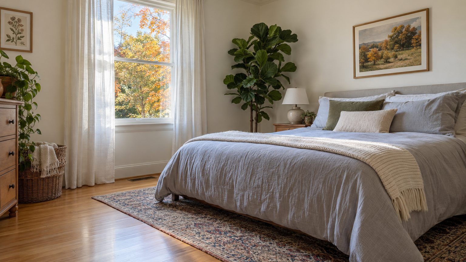

Yes, with a catch. Light paint makes a small room feel more open because it bounces more light around and softens the edges where walls meet. It does not change the square footage, and a pale color in a dim room can look flat and gray instead of airy. What you gain depends on how much light the color reflects, how much light the room gets, and how sharply the walls contrast with the trim and ceiling.
What light paint does to a small room, and what it doesn’t
The research here is thinner than the decorating magazines suggest. One widely cited experiment, by Daniel Oberfeld and colleagues at the University of Mainz, found that people judged rooms with lighter surfaces as taller than the same rooms with darker ones. It’s a perception effect measured in a lab, and it points in the direction designers have always claimed. It also says nothing about a 9-by-11 bedroom with one small window and a sagging ceiling.
Two things happen when you roll on a pale color. First, the walls reflect more of the light that reaches them, so the room is brighter overall and the corners are less shadowed. Second, light surfaces tend to lose their visual weight. Dark walls announce themselves, and you see where the room stops. Pale walls fade back, and your eye reads less boundary.
That second effect is the one people underrate. A small room feels cramped partly because you can see all four walls at once. Anything that reduces the visible “edges,” such as low contrast between wall, trim, and ceiling, helps as much as the color itself. A soft cream wall with bright white trim draws a crisp outline around every door and window. The same cream with trim in a near-matching shade draws almost none.
Light paint can also do real harm to expectations. Painting a cramped 100-square-foot room off-white will not make it feel like 150. Maybe it feels like a brighter, calmer 100. That’s still worth doing, especially in a room where you spend hours, but it helps to keep the claim honest.
Light reflectance value matters more than the color name
Paint companies sell color names. Light itself obeys a number: light reflectance value, or LRV, a scale from 0 (absorbs all light, like true black) to 100 (reflects all of it, which no real paint achieves). Most paint chips list the LRV on the back or in the online color details, and it’s the most useful number nobody checks.
Two paints sold as “light gray” can sit far apart on that scale. One might reflect roughly 70 percent of the light that hits it and the other closer to 55. In a bright living room, either works. In a windowless powder room, that gap shows up as a noticeably dimmer space. As a rough working rule, colors with an LRV in the 60s and above read as light, and the bright whites sit higher still. Mid-tones in the 30s and 40s start behaving like darker colors in a small room, even when the name on the lid says “soft” or “misty.”
Undertone complicates things. A pale blue-gray with a high LRV can still feel cold in a space that faces north, while a pale warm cream with the same number feels sunnier. Two colors with identical LRV values don’t look identical, because LRV measures how much light bounces off, not what color it carries.
A practical habit: when you narrow your choices to three or four, flip the chips over and compare the LRVs before comparing the colors. If the number is well below the others, that color will act darker once it’s on four walls, regardless of how it looked in the store.
When light paint backfires
North-facing rooms are the classic trap. Light from the north is cooler and dimmer through the day, so a bright white can turn dingy, bluish, or gray. People often respond by going even whiter, which makes the problem worse. A white with a touch of warmth (cream, soft ivory, a pale greige) usually holds up better. The goal is a room that looks lit, not a room that looks pale.
Windowless or one-window rooms present a different issue. If there’s very little daylight to reflect, paint can only do so much. Bulbs matter at least as much as walls here. A 2700K bulb gives a warm, yellow-leaning glow, while 5000K reads as bluish and daylight-like. Light paint under cold bulbs can look clinical, and under very warm bulbs it can drift yellow. Matching the color temperature across a room’s fixtures, so one lamp isn’t pulling the walls a different direction than another, does more than most people expect.
And then there’s the other school of thought. Some designers argue that in a small room with limited light, going dark is smarter than fighting the room’s character. A deep navy or charcoal blurs corners and makes the walls hard to read, so the room feels like an intentional cocoon instead of a failed attempt at spaciousness. It works best in rooms used mainly at night, like a media room or guest bedroom. It’s a legitimate choice, though it’s also one of the easier ones to regret, a pattern we cover in The Colors People Repaint Within a Year.
Ceilings change the math as well. If your problem is a low ceiling instead of narrow walls, where the paint stops can matter more than the shade itself. That’s the subject of A Low Ceiling: Where the Color Stops Matters More Than the Color, and its advice applies even when you’re going light.
How to choose and apply it so it actually works
Start with who uses the room and when. A home office used mostly from 9 to 5 gets the best of whatever daylight exists, so a light color earns its keep during the hours you’re there. A kid’s bedroom is often used heavily in the evening and early morning, when artificial light dominates, so test the color under the actual lamps. A guest room that sits dark for most of the month can handle a bolder choice because nobody’s judging it daily. Decide the time of day that counts most, then judge the color then.
Test it properly
Skip the tiny chip taped to the wall. Paint two large swatches, roughly 2 feet square, on different walls, or paint sample boards and move them around. Include the wall that gets the least light and the one next to the window. Look at them in the morning, at midday, and in the evening with the lights on, for at least two or three days. The color you picked under store fluorescents will not be the color you get at 7 p.m. in January.
Holding the sample next to your actual trim, flooring, and large furniture matters too. A pale color that looks crisp against white trim can look dingy against warm oak floors, and the reverse also happens. Hardwood, carpet, and tile all bounce their own tint onto the walls, and in a small room that tint is hard to escape.
Decide on sheen and edges
Higher sheens reflect more light. Eggshell or satin on walls will brighten a small room slightly more than flat paint, but they also show every bump, roller mark, and patched nail hole. Flat or matte hides flaws and looks richer, at the cost of being harder to wipe clean. For most walls in a small room, a low-sheen finish like matte or eggshell is the sensible middle. Reserve satin or semi-gloss for trim and doors, where durability counts.
On the edges: painting trim and walls in the same color, or very close to it, hides the lines that tell your eye where the room ends. Painting the ceiling a shade lighter than the walls (or the same pale color in a flat finish) keeps it from looking like a lid. Strong contrast between wall and ceiling is the thing most likely to make a small room feel boxed in.
If you’re working through other rooms too, the rest of our Decor coverage looks at how the same logic of light, occupant, and use plays out in different spaces.
A quick comparison of common scenarios
A short list helps here, because the right answer really does change with the room:
- South- or west-facing room with decent windows: almost any light color works, and warm whites or pale neutrals will glow in the afternoon.
- North-facing room: choose a light color with a warm undertone and a high LRV, and test it on cloudy days.
- Interior bathroom or hallway with no windows: a light color helps, but fixtures and bulbs do more of the work.
- Room used mainly at night: consider whether a deeper color would feel better than a pale one lit only by lamps.
None of that rules out a light palette. It just means the label on the can matters less than the conditions in the room. A pale color in a decent space gives you the brightness and calm that people are really after when they ask whether it will “look bigger.”
One last nuance: the effect fades with familiarity. Once you’ve lived in a room for a few weeks, your brain stops comparing it to what it was, and the room just reads as the size it is. What stays is the brightness, and that’s why light reflectance, not the illusion of extra square footage, is the number to chase.