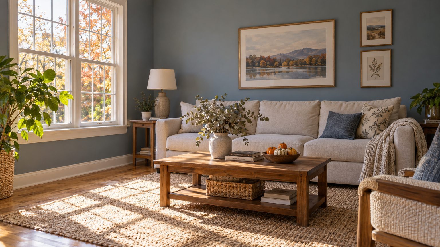

Paint a south-facing room in a color with some depth and a neutral or slightly cool undertone, and test it on the wall before you commit. The reason is simple. South light is the strongest and longest-lasting light a house gets, and it does two things to paint at once: it adds a yellow-gold cast at the edges of the day, and at midday it floods pale colors with so much brightness that they lose definition. Creamy yellows turn butter-colored, soft beiges go flat, and white can look almost blank. Mid-tone and deeper colors with a bit of gray or blue in them tend to hold their character.
That is the short version for the Northern Hemisphere. (In Australia or Argentina, the same description applies to a north-facing room.) The rest of this piece explains what is happening and how to pick a color that survives it. It also covers why the answer shifts from Phoenix to Portland.
Why south light warms and bleaches at once
Direct sun is not one color all day. Near sunrise and sunset it is low and amber, often somewhere around 2,000 to 3,000 Kelvin on the color temperature scale. Around noon it climbs to roughly 5,500 K, close to neutral white. Light from an open north sky is bluer, often 6,500 K or higher. A south-facing window gets sun for most of the daylight hours, so the room moves through the warm-to-neutral-to-warm cycle with very little blue sky light to counter it.
The “warming” is the easy part to see. A paint with any yellow, red or orange in its base picks up the amber light and pushes further in that direction. A greige that looks balanced in the store can drift toward tan. A white labeled “warm” can look like skim milk by 4 p.m.
The bleaching is subtler. Your eye adjusts to brightness, and when a wall bounces back a lot of light, pale colors compress toward white. The measure that matters here is light reflectance value, or LRV, a 0-to-100 scale where black sits near zero and pure white near 100. Many paint manufacturers publish the LRV for each color on their websites or on the back of the chip. A color with an LRV in the 80s sends most of the light that hits it right back into the room. In a south-facing room with a big window, that can read as glare rather than color, and the subtle tint you chose vanishes.
Sun angle adds a seasonal twist. At 40 degrees north latitude (roughly Denver, Philadelphia or Indianapolis), the noon sun stands about 73 degrees above the horizon at the summer solstice and about 27 degrees at the winter solstice. In July the sun is high enough that a roof overhang or porch may block much of it. In January it slants deep into the room and washes across the far wall and floor. So the same paint can look moderate in summer and intense in winter, which is the opposite of what most people expect.
Colors that hold up, and the ones that struggle
The pattern is easier to see if you sort by what the light does to each family rather than by trendy names.
Cool-leaning colors do well because the warm light neutralizes them instead of overpowering them. Soft blue-greens, gray-greens, sage with a trace of gray, and misty blues often look balanced in a south room, where they might look chilly in a north one. A pale blue that feels icy in a basement office can look like a calm, clean color here. The same logic applies to cool-leaning whites, the ones with a hint of blue, gray or green in the base. They keep a white wall from slipping into yellow by mid-afternoon.
Mid-tones and deep colors have a different advantage: they absorb enough light that the wall never blows out. Navy, forest green, deep teal, charcoal, aubergine and terracotta tend to look rich rather than dark in a bright south room, because there is plenty of light to bring them to life. Designers often point out that people avoid dark colors in sunny rooms for fear of making them gloomy, when the opposite room (a dim north one) is where dark paint is the harder call. If you have wanted a moody color and own a south window, this is the room to try it. For the opposite problem, the situation covered in A Room With No Window: The Light Is Whatever You Install, the logic flips entirely.
The colors that struggle are the ones that depend on subtlety:
- Pale yellows and creams, which can turn buttery or even greenish-yellow at midday
- Warm beiges and tans with a yellow base, which lose their depth and read as flat
- Very light grays, which can look like white with a smudge in them
- Peach and soft pink, which can tip toward orange in late-day light
None of these is banned. A pale warm color can be lovely in a south room if you go a step or two deeper than your instinct says, giving the paint enough pigment to stay visible. A cream that looks right on the chip is often too weak by the time the sun hits it, and the same cream one or two shades down the strip can look just right on the wall.
A word on whites
White is the hardest decision in a south-facing room, because it is the color that shows every undertone. A bright, high-LRV white can feel sharp in direct light. A slightly softened white, with a bit of gray in it, usually behaves better and looks less like a hospital hallway. Trim is the exception worth thinking about: a clean white on trim against a mid-tone wall adds crispness, and the contrast makes the wall color read as intentional.
Testing in real light, not at the store
The color on a chip has been viewed under controlled lighting, and the color on your wall will not be. The mechanics are covered in Why the Color on the Wall Is Not the Color on the Chip, but a south-facing room calls for a few specific habits.
Paint large samples, at least two feet square, and put them on more than one wall. A sample board (poster board painted with two coats) works well because you can move it around, but a patch painted straight on the wall tells you more, since it shows how the new color meets the existing one. Put one sample on the wall that gets direct sun and one on the wall that stays in shade. Those two will look like different colors, and you will live with both.
Then look at them at several times of day: early morning, around noon, mid-afternoon, and after dark with your usual lamps on. Evening matters more than people expect. A 2,700 K bulb and a 4,000 K bulb will change the same paint noticeably, so use the bulbs you actually own. Look for the moment the color goes wrong, whether that is the noon blowout or the late-afternoon yellowing, and decide whether you can live with it.
Check the surroundings too. Light that enters a south window also picks up color from outside. A green lawn, a red brick neighbor, or a shiny metal roof can throw a tint onto the walls, especially near the window. A mature tree on the south side filters light into something dappled and cooler for half the year, then drops its leaves and changes the room completely in winter. If you have deciduous trees outside, a winter test is worth the extra weeks.
Sheen is the last variable. Higher-gloss paint reflects glare, which a south-facing room already has plenty of. A flat or matte finish absorbs light and softens the wall, while eggshell offers more washability with only a little shine. For ceilings, flat is almost always the better choice in a bright room, since a sheen can show every roller mark when the sun rakes across it.
Where you live changes the answer
“South-facing” does not mean the same thing in every state. In Arizona, Texas, Nevada or inland California, the sun is strong, clear and often unfiltered for much of the year, so the bleaching effect is at its peak. Lean toward deeper colors and matte finishes, and treat the very palest options with suspicion. Window treatments matter as much as paint here, because a room with a bare south window in Tucson in July can feel like a greenhouse.
In the Pacific Northwest or the Great Lakes region, the story is different. Cloud cover is common for months at a time, and a south-facing room in Seattle or Cleveland may look gray for much of the winter, then briefly brilliant on a clear day. A color that looks perfect in a sunny week can feel cold and flat in November. People in those areas can often use warmer colors in south rooms than a Southwest homeowner can, because the light has less warmth of its own to add. Testing across a few different weather days is more important than testing at a particular hour.
Florida and the Gulf Coast add humidity and reflected light off water or pale sand, which can intensify glare. In the Mountain West, thin air at altitude means stronger UV and crisp, bright light, even at lower temperatures. And in northern states like Minnesota or Maine, the low winter sun makes a south room the brightest in the house during the very months when you need it most, so you may want to preserve that warmth rather than fight it.
One more factor is easy to overlook: fading. Ultraviolet light fades fabrics, wood floors and artwork, and a south window delivers more of it than any other orientation. Paint can shift over the years too, with some intense reds and yellows more prone to fading than other pigments. Window film that filters UV, lined curtains, or sheer shades can protect furnishings, and they also soften the glare that makes pale paint look washed out, so they do double duty.
The seasonal swing is worth planning around. If you pick a color in July, when a high sun is partly blocked by your eaves, you are seeing the room at its mildest. If you paint in November, you may be judging it just as the low sun starts reaching deep across the floor. Whichever season you choose, put a sample up and check it again in the opposite one before you buy the gallon, or at least before you paint the second wall.
For the broader set of room-by-room color decisions in this series, the Decor section collects the related guides in one place.