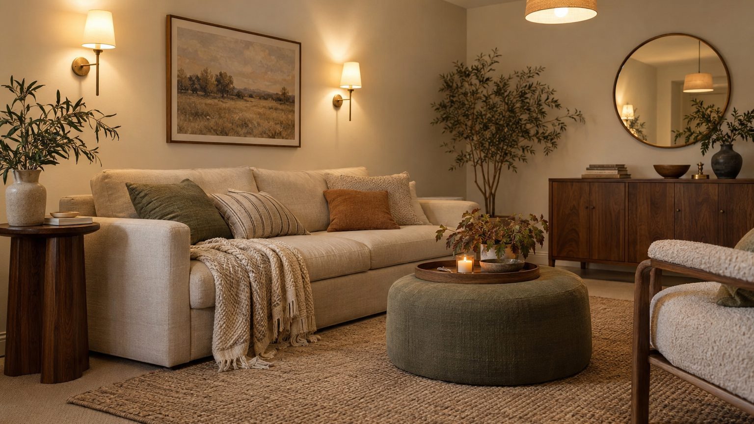

Paint color in a windowless room depends on the light fixtures first and the paint second. There is no daylight to shift a wall from cool morning gray to warm afternoon cream, so the color you see is the paint filtered through whatever bulbs you screwed in. For most rooms the winning moves are the same: warm, light-reflecting neutrals if you want the space to feel bright, or a fully committed deep color if you want a cocoon. The mid-tone, in-between shades are where windowless rooms go wrong.
The bulb is the real paint color
Daylight is a moving target. It runs from the amber of sunrise to the bluish cast of an overcast sky, and a room with a window absorbs all of that variation. A paint chip that looked soft and gray at 10 a.m. may read lavender by dinner. Windowless rooms skip this problem, which is the one real advantage of the setup. The light is fixed, so once you choose it, the color stops surprising you.
The number to watch is color temperature, measured in Kelvin. Bulbs around 2700K give the soft, golden glow of old incandescents. At 3000K the light turns slightly whiter, 4000K reads as neutral, and 5000K approximates a bright daylight look that many people find clinical indoors. Each one pushes paint in a predictable direction. Warm bulbs add yellow and orange, so a cream turns buttery, a gray picks up a beige cast, and blues lose their punch. Cool bulbs do the opposite, pulling whites toward blue and making warm beiges look faintly green or flat.
A second number matters nearly as much: the color rendering index, or CRI. It rates how faithfully a bulb shows colors compared with a reference light. Budget LEDs often sit around 80, which is enough to make reds and warm browns look muddy. Bulbs rated 90 or higher render paint much closer to the chip, and many packages now print the figure. In a room where the bulb is the only light source, that extra accuracy is worth a few dollars per bulb.
Two habits save the most grief. First, buy the bulbs before the paint, and put the same temperature in every fixture in the room. A 2700K sconce next to a 4000K recessed can makes one wall look like two different paints. Second, treat the bulb choice as permanent. Swapping to a cooler bulb a year later will change the wall color as surely as a new coat of paint would.
Light or dark: let the room’s job decide
When light walls earn their keep
Every paint color carries a light reflectance value, or LRV, on a scale from 0 (black) to 100 (pure white). Many manufacturers list it on the back of the chip or on the product page. In a windowless room, LRV works like a multiplier on the light you already have. On a single bounce, a wall with an LRV of 70 sends back roughly twice as much light as one at 35. With no window to make up the difference, that gap is visible.
That makes warm whites, pale putty, soft creams and gentle butter yellows the dependable choices for interior bathrooms, laundry rooms, hallways and home offices. Aim for an LRV in the 65 to 85 range for the walls, and go higher on the ceiling, where bright whites often land in the high 80s or low 90s. The ceiling is the largest surface bouncing light down onto everything else, so a dingy or tinted one quietly taxes the whole room.
Cool grays deserve suspicion here. Under a 3000K bulb, a mid-light cool gray can turn the color of wet concrete, and in a room with no daylight to rescue it, the effect never lifts. Whether pale paint actually makes a compact room feel larger is a separate and more nuanced question, one we unpack in Does Light Paint Actually Make a Small Room Look Bigger?. In a windowless room, though, the practical case for light color is simpler: it gives you more usable brightness from the same fixtures.
When to go deep on purpose
Dark paint is not a mistake in a room without windows. It can be the best use of the situation. A media room, powder room, home bar or wine closet is used mostly in the evening, under controlled light, and nobody expects it to feel airy. Deep green, ink blue, charcoal or aubergine on walls turns the lack of a window into a design feature. A dark color absorbs most of the light that hits it, so edges blur and the room reads as intimate instead of boxed in.
The commitment has to be total. Painting the ceiling the same color as the walls (often called color drenching) removes the hard line where a dark wall meets a white ceiling, a line that otherwise makes the ceiling look like a lid. Trim in the same color, perhaps in a different sheen, finishes the effect. Finish matters more with dark paint than light. A flat finish soaks up light and looks velvety, while a satin or semi-gloss reflects bulbs as bright glare spots, which is a point we cover in The Same Color in Two Finishes Is Two Colors.
Dark rooms also need more lighting than you would guess. The walls swallow a large share of every lumen, so plan extra fixtures and put everything on dimmers. Dark paint with a single overhead fixture produces a cave, and not the cozy kind.
The trap sits in the middle. Colors with an LRV between roughly 25 and 45 are dark enough to eat light and light enough to look like a decision you did not finish. In a windowless room, mid-tone khaki, medium taupe or a dusty mid-blue tends to read as dull and slightly dirty. Choose a side.
Use also changes the answer. An interior bathroom gets short, bright visits, which favors light, warm and slightly fresh colors. A basement family room used for movie nights can go deep. A walk-in closet is the place where color accuracy matters most, because you are matching clothes, so a high-CRI bulb and a clean warm white beat any moody shade. For more on how a room’s purpose and light interact, the rest of the Decor section works through the same logic room by room.
Build the lighting so the paint can work
Start with a legal and safety footnote that surprises many renters and buyers. The International Residential Code (adopted in various forms by most states, with local amendments) normally expects habitable rooms to have windows equal to at least 8 percent of the floor area. It also contains an exception for rooms lit artificially at an average of 6 foot-candles, measured 30 inches above the floor. That is a low bar, a fraction of what a typical office delivers, so treat it as a legal floor and not a design target. Separately, sleeping rooms, including basement bedrooms, must have an emergency escape and rescue opening. A windowless room generally cannot be a legal bedroom no matter how nicely it is painted. Check your local code or ask your building department before calling an interior room a bedroom.
For the lighting itself, think in layers instead of a single ceiling fixture. A common rule of thumb for general living spaces is about 20 lumens per square foot. A 10-by-12-foot room is 120 square feet, so that works out to around 2,400 lumens of general light before you add task lighting for a desk, vanity or reading chair. Dark paint pushes you toward the high side of any range. Check the lumens on the bulb box, not the wattage, which says little about brightness with LEDs.
Where the light lands matters as much as how much there is. Lit vertical surfaces make a room feel brighter and more open than a bright floor or a bright ceiling alone. Wall sconces, picture lights and cove or wall-washing fixtures that graze the walls turn the paint itself into a light source. A single recessed can in the middle of the room does the opposite, leaving the corners dim and exaggerating the feeling of enclosure. Bouncing some light off the ceiling, with an uplight or a fixture with an open top, helps a white ceiling earn its high LRV.
A few other fixes round out the toolkit:
- Dimmers on every circuit, so one room can run bright for cleaning or work and low for evening.
- Tunable-white bulbs (adjustable between roughly 2700K and 5000K or more), which let you test both extremes against your paint before settling on a standard.
- LED panels that imitate a skylight, which add a convincing wash of daylight-like light but have no effect on legal window requirements.
Cooler, brighter light during the working day and warmer light after dark is a common approach in rooms that never see the sun, and it keeps the room from feeling stuck at one time of day. The scientific evidence for health benefits at home is still mixed, so choose it for comfort, not as a cure for anything.
Test the paint under the lights you will actually use
Store lighting is the worst place to judge a windowless room color, because the fluorescent or LED tubes above the paint aisle bear no resemblance to the fixtures at home. Take samples back to the room itself, with the final bulbs installed and on. That sequence matters: lights first, paint second.
Paint a sample board or large poster board, at least two feet square, with two coats, instead of dabbing swatches on a wall that already has a color on it. Tape it up on different walls, including the one nearest the main fixture and the one farthest away, since the same paint can look like two colors across a single room. Check the sample at the brightness and time of day you will actually use the room, and at full and low dimmer settings. Let the paint dry completely before judging it, because wet paint reads differently from dry, and many colors take several hours to settle.
Put the sample next to the things that will share the room: the flooring, the trim color, a piece of upholstery, a towel. A paint that looks clean on its own can turn sallow beside a warm wood floor. A sample pot costs far less than repainting four walls and a ceiling.
One last nuance on LRV: the number comes from the manufacturer’s lab conditions, not from your room. A color rated 75 will deliver less actual brightness if the floor is dark walnut and the sofa is charcoal, because those large surfaces soak up much of what the walls reflect.