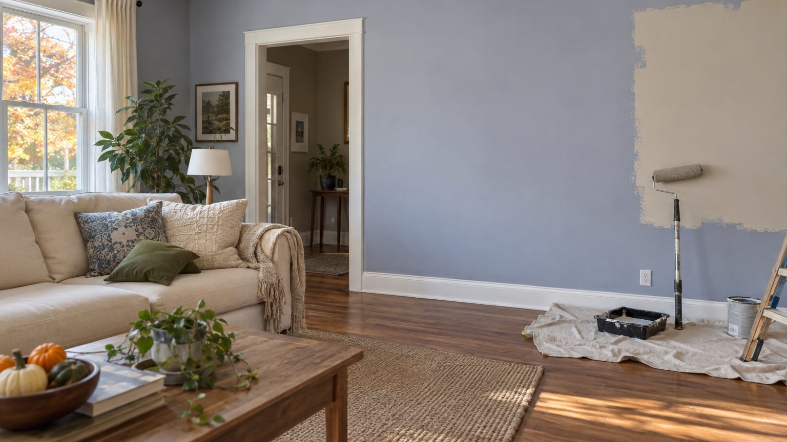

Five families of color account for most of the do-overs: cool grays with a blue or purple undertone, stark bright whites, saturated “statement” colors like tomato red and sunny yellow, deep dark shades in dim rooms, and beiges that turn pink or green once they hit the wall. The colors themselves are rarely the problem. Undertone, light direction and neighboring finishes decide whether a shade looks right or looks off, and most people only find out after the second coat dries.
That distinction matters because it changes how you pick. Avoiding “bad” colors is a losing strategy, since every one of the shades above looks great in the right room. The better approach is knowing why each one fails so you can recognize the warning signs in your own house. This page sits inside our wider guide to Decor, and it focuses on the failure side of the question.
Five color families that get painted over fastest
Cool gray tops the list. During the 2010s it became the default “safe” neutral in flips, rentals and builder spec homes, and plenty of owners painted whole floors in it. Gray is never just gray, though. Many popular versions carry a blue, green or violet cast that stays hidden on a small chip and shows up fully across four walls. In a north-facing room, where daylight already skews cool, a bluish gray can read as a hospital hallway. Designers have been steering clients toward warmer neutrals for years, and a lot of those clients are repainting the gray they chose a decade ago.
Stark white is the second repeat offender, and it surprises people because white feels like the risk-free option. Bright, crisp whites often contain a touch of blue to look “clean.” In a sunny south-facing room, that translates into glare, with walls so bright they feel flat and slightly clinical. In a room with weak northern light, the same white drifts toward gray-blue and looks dingy. White with a hint of warmth (cream, soft ivory) forgives far more.
Saturated, high-energy colors come next. Fire-engine red, lemon yellow and electric teal look wonderful on a swatch the size of a playing card. Spread across 400 square feet of wall, they get louder, because a color seems more intense the more of your field of view it fills. Yellow is the classic example. A shade that looked like butter on the chip can feel like a highlighter in a kitchen with morning sun. People often keep these colors in a dining room or powder room, where the exposure is short, and repaint the ones they live in daily.
Dark colors in dark rooms form the fourth group. Deep navy, charcoal and forest green have been popular for years, and in a room with big windows and good light they look rich. Put the same navy in a basement den or a bedroom with one small window and it eats the daylight, so the room feels smaller and gloomier at 3 p.m. than you pictured. Dark paint also shows every wall flaw, from patched drywall to uneven corners, since there is nowhere for imperfections to hide.
Finally, the sneaky one: beige and “greige.” These muddy neutrals have undertones (pink, yellow, green) that are nearly invisible alone. Place them beside honey oak floors, a tan carpet or a granite countertop with its own undertone, and the wall color picks a fight. A common complaint is a beige that suddenly looks pink next to orange-toned wood. The paint did not change. Its neighbors did the work.
Why the same color works in one house and fails in the next
Light direction explains more regret than any other factor. In the northern hemisphere, north-facing rooms get steady, cooler, indirect light that pushes colors toward blue and gray. South-facing rooms get strong, warm light for most of the day, which can wash out pale colors and make warm ones feel hot. East-facing rooms are golden in the morning and cooler by afternoon. West-facing rooms are the reverse, with a dull midday and a vivid orange glow in the evening. One paint can look like four different colors across those four exposures, so a color you loved at a friend’s house tells you very little about your own.
Artificial light adds a second layer. Bulbs are rated by color temperature in Kelvin. Soft, warm bulbs sit around 2700K, while “daylight” bulbs run 5000K or higher and give a bluish-white cast. Swap warm bulbs for daylight ones and a cream wall can look sterile. Many people judge a color during the day and live with it at night, which is exactly when most of us are home. If you are trying to understand how a particular room behaves, our parent guide on room color by occupant and light covers that in more depth.
There is also a number worth knowing, the light reflectance value (LRV), printed on the back of many paint chips and listed online by most major brands. It runs from 0 (absorbs all light) to 100 (reflects all of it). Real paints land well short of both ends. A low LRV means the color will soak up light and read darker, which is useful for a sunny den and painful in a dim hallway. It takes ten seconds to check, and almost nobody does.
Then come the finishes you already own. Flooring, cabinets, countertops and trim set the undertone context for any wall color. Cool paint against warm wood looks deliberate when the contrast is strong and looks confused when it is almost, but not quite, a match. Sheen matters too. Flat paint hides surface flaws and absorbs light, which deepens color. Eggshell and satin bounce more light back and can make the same color look a shade lighter and slightly cooler.
The size myth
A related misfire is the belief that light paint will rescue a cramped room. Pale colors can help, but they are not magic, and the effect depends heavily on light and contrast. We break down what actually happens in Does Light Paint Actually Make a Small Room Look Bigger?, and the short version is that a bright white in a windowless room can still feel like a box.
How to test a color so you don’t repaint it
Start with the sample method. Chips are too small and too easy to misjudge. A painted sample, roughly two feet by two feet, tells you far more. Apply two coats, because one coat of many colors looks thinner and different once it is fully built up. Paint the sample directly on the wall rather than on a white board if you can, and leave a white border around it so your eye has something to compare against. Peel-and-stick samples work well if you don’t want to patch later.
Then live with it. Check the sample at three times of day: morning, midday and evening with your actual lamps turned on. Look at it from the doorway, from the far corner and from the spot where you will sit most. Try it on at least two walls, since a wall that faces the window and a wall that faces away from it will not match. Give the whole exercise two or three days, not an afternoon.
A short checklist helps keep the decision honest:
- Which direction do the room’s windows face, and when do you use the room most?
- What undertone do the floors, counters and cabinets carry?
- What is the LRV, and does it suit how much natural light the room gets?
- Which bulbs will you actually use in the evening?
- How does the sample look next to your trim color, not just alone?
Occupant matters as well, and it is the piece people skip most often. A room used mainly at night (a bedroom for someone who works days) has different needs than a home office filled with daylight from nine to five. The same goes for kids’ spaces, where preferences change quickly. If you are painting for a baby, our piece on Choosing a Nursery Color When the Occupant Has No Opinion walks through how to pick something that will still work in two years.
On quantity, a typical gallon covers roughly 350 to 400 square feet. A 12-by-12-foot room with 8-foot ceilings has about 384 square feet of wall before subtracting doors and windows, so one coat nearly uses a gallon and two coats call for two. That puts the cost of a mistake in perspective. Two gallons of quality paint, plus primer, tape, roller covers and a weekend of labor, is real money and real time, and a professional repaint adds a few hundred dollars per room on top of that. A few sample pots cost a small fraction of the same effort.
If you already hate it: what to try before repainting
Give it two weeks, at least. Fresh paint looks different wet than dry, and it often looks different once furniture, rugs and art are back in place. Many people react to a room that is half-furnished and still smells like paint. Hang pictures, bring back the curtains and see whether the problem fades.
Then test whether the culprit is the paint at all. Changing a bulb from 5000K to 2700K can shift a room more than a new gallon would, and it costs a few dollars. Swapping heavy white curtains for something warmer, or adding a rug with the right undertone, can fix a wall that was fighting its surroundings. If the color is truly dark and the room is truly dim, add lamps at different heights instead of relying on a single overhead fixture.
If repainting is the answer, plan for the cover-up. Going from a dark color to a light one usually needs a coat of primer, and sometimes two coats of finish, because deep pigments can bleed through. Going from a saturated red to a pale neutral is the hardest version of this. Tinted primer helps a lot, and it is worth asking the paint counter to tint it toward your new color. Moving from a light color to another light color is the cheapest and easiest swap by far, so if you must correct course, doing it sooner (before you build furniture and décor around the wrong color) saves the most trouble.
Lastly, one nuance about the “repainted within a year” claim itself. Nobody tracks regret precisely, so the lists above come from recurring patterns reported by painters, designers and paint retailers, not a single national survey. What the patterns agree on is the cause: choices made from a small chip, in a showroom, under different light than the room will ever have. Painters often say the fix costs nothing, and it is to carry the sample home and leave it up for a week before opening a single gallon.