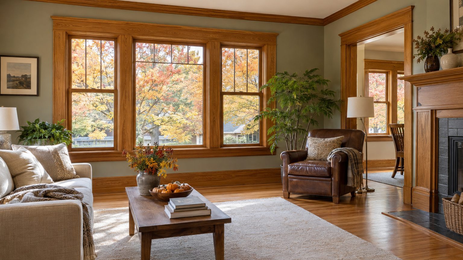

Choose the wall color after you read what the wood is doing, not before. Most trim you can’t paint leans orange, yellow or red, and the walls that look best either echo that warmth or push against it with a muted, slightly cool tone. Cool grays, stark builder whites and pastel peach are the usual casualties, because each one makes the wood look more orange than it really is.
The reasons for leaving trim alone vary. A lease may forbid it. An HOA or preservation agreement may have a say. Or the wood is simply good, with real grain and decades of patina, and burying it under paint would be a shame. Whatever the reason, the trim is now a fixed part of the palette, like a floor or a kitchen countertop, and the walls have to be chosen around it.
Read the wood before you open a paint can
Wood trim has an undertone, just as paint does, and it falls into a few broad families. Honey oak, golden oak and pine run yellow to orange. Red oak, cherry and mahogany lean red-brown. Walnut and espresso stains read as deep brown, sometimes with a cooler, almost charcoal edge. Maple and birch are pale, creamy and a little yellow. Most rooms mix two or three of these (trim, doors, floors, built-ins), and they rarely match.
Age adds a twist. Oil-based polyurethane, the standard clear finish for decades, ambers as it cures and ages. Trim installed in a 1990s house usually looks warmer and more orange today than it did on move-in day. That is why a wall color that worked in a showroom photo can look wrong against 30-year-old woodwork.
An easy way to find the undertone is to hold a plain sheet of white printer paper against the trim in daylight. Against the white, the wood’s true cast shows up: yellow-orange, rosy red or neutral brown. Do the same with the floor. If the two woods disagree (say, orange trim and red-brown floors), choose a wall color that sits calmly between them and doesn’t pick a side.
One more habit helps. Look at the trim away from the window too. Wood near a bright window reads lighter and more yellow, while the same trim in a shaded corner reads darker and browner. Your wall color has to work with both versions.
Wall colors that work, by wood family
Color theory gives a useful starting rule. Orange sits opposite blue on the color wheel, so a muted blue or blue-green makes orange wood look intentional and rich. A saturated blue can turn the room into a clash, though. Grayed, softened versions (dusty blue, blue-green, slate with a touch of green) are the safer route. Red wood has a different partner, green, for the same reason.
Here is how that plays out for each family.
Honey oak and pine. The warm route is a creamy white or soft butter tone that lets the wood look like part of one family. The contrast route is sage, olive or a gray-green, which cools the room without fighting the grain. Deep navy also works, and it makes the wood glow, though it needs good light and a confident hand. Avoid true cool grays. Next to yellow-orange trim they can read slightly lavender, and the oak turns brassier by comparison. Stark, blue-leaning whites do the same thing.
Red oak, cherry and mahogany. Greens are the natural partner here, particularly gray-greens and deeper forest tones. Warm taupes and soft clay shades also sit comfortably. Be careful with pink-leaning beiges and rosy neutrals, which blur into the red and leave the room feeling flushed and monotone.
Walnut and dark espresso. Dark wood frames a room, so lighter walls let that frame show. A warm white, a pale greige or a light plaster tone gives clean contrast. Moody deep colors can work too (charcoal green, ink blue), but the room needs plenty of daylight or the whole space turns cave-like. Test in the dimmest corner first.
Pale maple and birch. These forgive almost everything. Watch only for yellow-leaning creams, which can make the wood look jaundiced. A soft white, a gentle gray-green or a pale blue all behave well.
On the white question specifically, a warm, slightly creamy white is a safer match for most orange-leaning trim than a crisp bright white. The crisp version makes the contrast so sharp that the wood looks dated, like a stain someone forgot to update. A softer white lets the trim read as a feature.
Light, sheen and the supporting cast
Paint companies print a number on many swatches called LRV (light reflectance value), a scale from 0 (absorbs all light) to 100 (reflects all of it). It helps with trim-heavy rooms. A wall color with a higher LRV bounces more light around, which keeps heavy wood from dominating a small or dim room. A wall with a low LRV pulls the room darker and makes the trim look even more prominent. Dark trim with dark walls can be beautiful, but only when the room has good natural light.
Direction of light matters as much as the paint. North-facing rooms get cooler, bluer light, which can make gray and blue walls feel chilly and flat next to warm wood. A warmer wall color compensates. South-facing rooms get strong, warm light for much of the day, and they can handle cooler greens and blues without feeling cold. East-facing rooms are warm in the morning and neutral by afternoon, and west-facing rooms turn golden in the evening, which amplifies orange wood right when most people are home. This is the main reason one paint color can look like three different colors in the same house.
Light bulbs count, too. Warm bulbs around 2700K deepen the orange in oak and pine. Bulbs near 5000K, sold as daylight, make the same wood look harsh and a bit greenish. Most living spaces sit well between 2700K and 3000K, and swapping bulbs is the cheapest adjustment in the whole project, especially for renters.
Sheen is the last piece. Wood trim is usually glossy from its clear finish, so a matte or eggshell wall finish keeps the trim as the crisp frame. A shiny wall competes with it, and the whole room starts to look busy. Ceilings can stay white, or take a lightened tint of the wall color, which softens the line where the trim meets the ceiling. Since trim often runs along the ceiling in older houses (crown molding), a stark white ceiling can make that molding look orange by contrast. A very light warm white is the gentler choice.
Occupant matters here, and it is the thread that ties this to the rest of the silo. A nursery or a child’s room with honey oak trim has different needs from a home office. Kids’ rooms usually get used with plenty of artwork, toys and bedding that bring their own color, so quieter walls tend to win. For a long-lasting scheme, see Paint Colors for a Girl’s Room That Outlast the Phase, which handles the same problem from the other direction: choosing a base that survives changing taste. Renters have the opposite constraint, with the wood fixed and the paint usually limited, and Renting: What You Can Actually Change covers what is realistic there.
Test the pairing the right way
A two-inch chip held up to the trim tells you very little. Paint a sample on a large piece of poster board (about 2 feet by 2 feet is a reasonable minimum) or use a peel-and-stick sample, and tape it to the wall right beside the trim. Leave a bit of the old wall visible around the edges. Then look at it at different times, ideally over two or three days, because the room changes with weather and sun angle as much as with the hour.
Check the sample in three places: near the window, on the wall opposite the window, and in the dimmest corner. Look in the morning, at midday and in the evening with your regular lamps on. If the color only looks right at noon, it is the wrong color, since most rooms are used at night.
Three mistakes show up again and again with trim-heavy rooms:
- Picking a gray from a swatch card without checking for a violet or blue cast beside orange wood.
- Matching the wall to the trim too closely, so the room feels like one flat brown or tan block.
- Judging the color from a quart sample painted in one spot on a sunny day.
If you rent, run the plan past the landlord in writing before you paint anything, and ask whether repainting to the original color at move-out is required. Many leases require it, and a bold wall color means a bigger bill or a weekend of work later. Neutral shades with a clear connection to the wood (a warm greige or a soft sage) are cheaper to reverse than deep tones. For more room-by-room ideas, the Decor section collects the rest of this silo.
One last detail, which surprises people: the same oak trim looks noticeably more orange at 6 p.m. under 2700K lamps than it does at noon in daylight. Judge your sample at the hour you actually use the room, because that is the version of the wood you will live with.