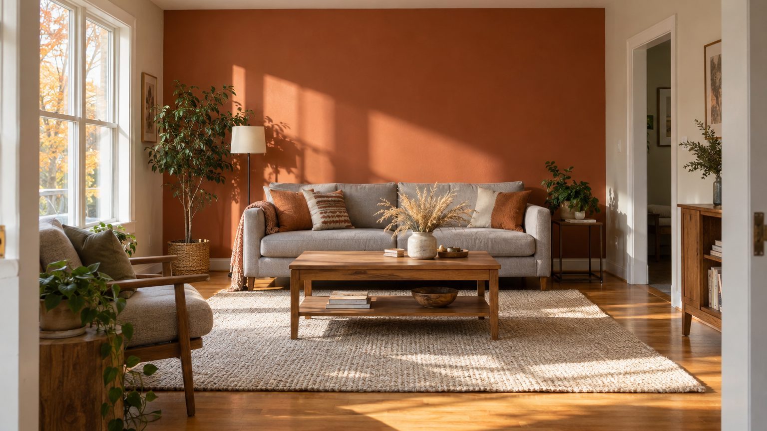

Yes, an accent wall still works, but only when it earns its place. A single painted wall holds up in rooms where one wall already dominates the view: the one facing the doorway, the one behind a bed, or a fireplace wall. It falls flat when the wall is picked at random, usually because it was the only one “without windows” or the one the painter happened to start on.
The short version of the rule: choose the wall your eye lands on first when you walk in, as long as it is a plain, unbroken surface. Then pick a color that makes sense for the light that wall gets and for the person who uses the room. The rest of this article covers how to do that.
Why the accent wall fell out of favor, and what replaced the old version
Somewhere in the 2000s, the single bold wall became the default move for anyone who wanted a change without repainting a whole room. Burgundy behind the sofa. Teal behind the bed. Often the choice had no logic beyond “this one’s easiest.” Design writers started calling the look dated, and plenty of homeowners agreed after living with it for a few years.
The criticism was fair, but it targeted the execution more than the idea. A wall painted a random color, unconnected to anything else in the room, reads like a sample swatch someone forgot to finish. Meanwhile, the opposite approach has grown popular: color drenching, where walls, trim, and sometimes the ceiling all get the same hue. It looks confident, and it suits people who commit. It also takes more paint, more prep, and more nerve than most weekend projects allow.
The accent wall sits between those two extremes, and that is where it still makes sense. It works for people who want depth without wrapping a whole room in a strong color, for rooms where three of the walls are broken up by windows and doors, and for renters and anyone planning to sell, since one wall is easy to repaint. If you are weighing a second color more broadly, Two Colors in One Room Without It Looking Like Two Rooms goes deeper on how to keep the pairing from splitting the space.
Which wall to choose
Stand in the doorway with the lights on and look straight ahead. Whatever wall your eyes settle on in the first two or three seconds is the leading candidate. That wall already acts as the room’s backdrop, so color there reinforces something your brain is doing anyway. Color on a wall you only see from the side asks you to turn your head to appreciate it.
Then run a second check: how many things interrupt the wall? A clean expanse of 10 to 12 feet with no door, no vent, and no off-center window is ideal. Every interruption chops the color into pieces, and the “accent” starts to look like a patchwork. A wall that has one feature, like a fireplace, a built-in, or a bed headboard, is better still, because the feature gives the color a reason to exist.
The walls to skip
The wall with the window is usually a poor choice, even though it feels like the obvious one. Daylight pours in from behind everything on that wall, so the surface looks darker than it is, and a deep color around the glass increases the contrast between the bright outdoors and the dim frame. That is the setup that makes people squint. The same goes for a wall broken by two doorways, or by a long run of kitchen cabinets and appliances.
In an open floor plan, avoid a wall that ends mid-room with no corner. Paint stops cleanly at an inside corner, and it can look arbitrary anywhere else. If a wall continues into the next space without a break, choose a different one or accept that the color will need to travel.
Room by room
Bedroom: the wall behind the headboard, nearly every time. It is the one you face from the door and the one you stare at while sitting up in bed. The bedroom has its own logic about calm and color, which is worth reading in The Main Bedroom: The Room You See First and Last.
Living room: the fireplace wall if there is one. Without a fireplace, take the wall opposite the main entry. A darker color behind a wall-mounted TV can also soften the contrast between a bright screen and a pale surround, which some viewers find easier on the eyes in the evening. It is a modest benefit, but it is a real reason to pick that wall over another.
Home office: the wall behind your desk chair, since that is what appears on video calls. A mid-tone color there looks more composed on camera than bare white, which tends to blow out in webcam exposure.
Dining room: the wall you see from the kitchen or hallway, not necessarily the one behind the table. Guests rarely look at the wall behind their own chairs.
Kids’ rooms: the wall beside the bed or the wall at the foot of it. Both can be repainted in an afternoon when a six-year-old becomes a teenager, which happens faster than anyone expects.
Choosing the color: light first, then the person
The same paint behaves differently depending on which direction the room faces and what time of day you use it. North-facing rooms get cooler, flatter light, and colors tend to look darker and slightly bluer than the chip suggested. South-facing rooms get warm, strong light, so a color can look brighter and warmer than expected, especially in the afternoon. East rooms are bright in the morning and dimmer later, and west rooms do the reverse.
Paint cans carry a number worth checking: the Light Reflectance Value, or LRV, a scale where 0 is absolute black and 100 is perfect white. Most manufacturers list it on the swatch or the product page. A wall with a low LRV absorbs light, so in a dim room it can look heavy or muddy. A higher LRV bounces more light around. If a room is already short on daylight, a mid-range LRV accent wall usually reads richer than a very dark one, which can simply vanish into shadow.
Here is where occupant comes in. Think about when the room gets used. A bedroom used mostly at night will be seen under lamps, so test the color under the actual bulbs you plan to keep. A home office used from 9 to 5 needs a color that works in daylight. A family room that comes alive after dinner can handle a deeper shade because lamplight tends to flatter it. Someone who works night shifts and sleeps in the day might want a color that holds its depth with blackout curtains closed, which usually means skipping pale, cool tones that go gray without sunlight.
Practical ways to decide:
- Start from something that already exists in the room, such as a rug, a piece of art, or upholstery, and pull a shade from it.
- Stay in the same color family as the other walls, going two or three steps deeper on the same paint strip, if you want a subtle result.
- Choose a contrasting hue only if you can name one object that links it to the rest of the room.
Sample on at least two different walls, with a patch of roughly two feet square or a large painted board you can move around. Look at it at 8 a.m., at noon, and after dark. A color that survives all three is worth the gallon.
Getting it done: paint, finish, and options for renters
Dark and saturated colors often need more coats than you expect, sometimes three. A tinted primer helps, and deep shades usually go on more evenly over a primer toned toward the final color. Ask the paint counter about it when you buy; it is a standard question and saves you a coat.
Sheen matters on a statement wall. Flat and matte finishes hide bumps and patched holes, which is helpful on older plaster or drywall that has seen a few picture hooks. Eggshell and satin are easier to wipe clean, a better call in a hallway or kids’ room, but they reveal flaws under side lighting. If the wall is lit at a sharp angle by a nearby window, go flatter.
Painting only one wall also means careful cutting in at the corners. Work the line at the inside corner with an angled brush, and remove outlet covers rather than painting around them. Tape helps on trim, though pulling it while the paint is still slightly tacky tends to give a cleaner edge than waiting until it is fully dry. The accent wall should meet the adjacent wall at a corner. If a wall wraps around an outside corner (a protruding chimney breast, for instance), the whole projecting face can take the color, which looks intentional.
Renters have more options than “ask the landlord.” Check the lease first, since some allow paint if you return the walls to the original color. If not, removable wallpaper and peel-and-stick panels can produce a similar effect and come off without much damage on smooth, properly cured painted surfaces (results vary on textured walls or fresh paint). A large piece of art, a wide framed textile, or a tall bookcase painted or filled with color also creates a focal point without touching the wall.
One last detail that saves headaches: label the leftover can with the room, the wall, and the date, and store it with a bit of the paint on a scrap of drywall or an index card. Touch-ups years later are much easier when you know exactly which can you are opening, and a batch mixed at the store months apart can vary slightly, so keep the original for patching. For more room-by-room color thinking, the Decor section has the rest of the series.