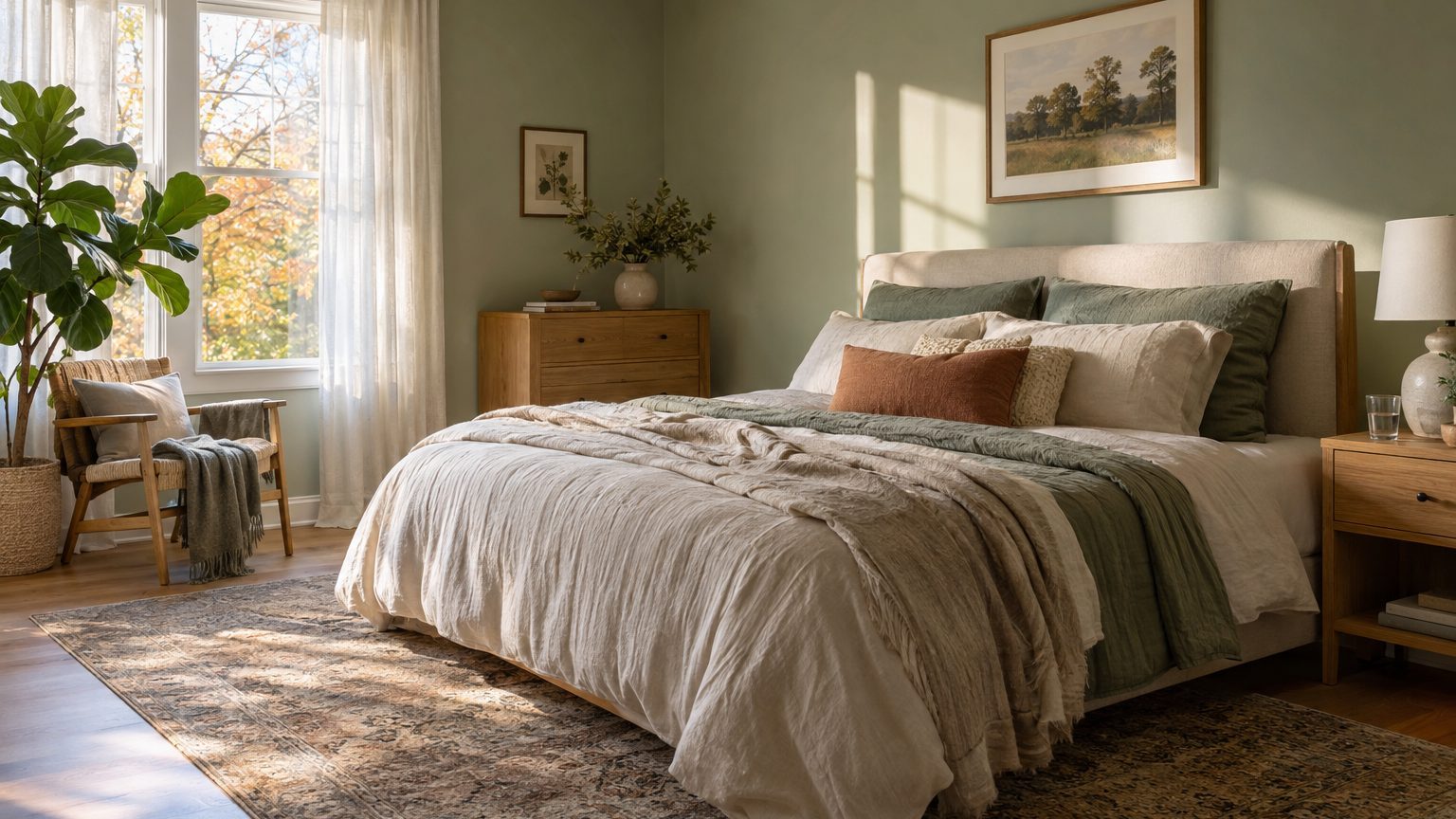

The best master bedroom colors are low in saturation, sit in the light-to-mid range, and lean toward whatever undertone the room’s own light lacks. Soft greens, warm off-whites, muted blues, and clay-tinged neutrals do this well. A deep navy or charcoal can also work, but only if the lighting is planned around it. Most mistakes come from choosing a color on a store card, under store lighting, and never checking it at 6:30 a.m. or 11 p.m.
Real estate listings have drifted toward “primary bedroom” in recent years, and several large Realtor associations have dropped “master” from their forms. People still search the older term, so this guide uses both. Whatever you call it, this is the room that gets the first and last look of your day, and the color decisions follow from that.
Two light conditions that decide everything
Seven hours of sleep a night adds up to roughly 2,555 hours a year, about 106 full days. Most of them are spent with your eyes closed, which is why bedroom color is judged in the narrow windows when you’re awake in it: waking up, dressing, reading, winding down. Those windows happen under two very different kinds of light.
Morning light depends on which way the windows face. In the United States, north-facing rooms get cooler, bluer, indirect light all day, which can turn a gray-beige into something closer to cold concrete. South-facing rooms get the strongest, warmest light and forgive almost anything, including cooler paints. East-facing bedrooms glow yellow at sunrise and flatten out by noon. West-facing ones start dim, then flood with orange light in late afternoon, which is when a sage green can briefly turn olive.
Evening light is mostly your own doing. A bulb rated 2700K (the “warm white” most people associate with incandescent lamps) pushes everything toward yellow and amber. A 4000K or 5000K bulb strips that warmth out and makes the same wall look sharper and grayer. If you care about how paint reads at night, check the color rendering index on the bulb box. A CRI of 90 or higher renders colors more faithfully than the 80 many standard LEDs settle for.
Then there’s light reflectance value, or LRV, a 0 to 100 scale where 0 is absorbing all light and 100 is reflecting all of it. Manufacturers list it on many swatches and online color pages. A pale greige might land in the 60s or 70s. A deep navy can fall below 10. Low-LRV colors make a bedroom feel enclosed and quiet, which many people want, but they also swallow lamplight. A dark room needs more lamps at more heights, or reading in bed becomes an eye-strain project.
Color families, and what each one asks of you
No color is calming by itself. What you’re really choosing is a bundle of undertone, depth, and how much the room’s light will bend it. With that in mind, here is how the usual candidates behave in a bedroom.
Soft neutrals and warm whites
Greige, mushroom, oatmeal, and creamy off-white remain the safest picks because they act like a backdrop for bedding, art, and wood tones. They also carry the biggest trap: undertone. A beige with a pink undertone beside a gray carpet looks muddy. A cool gray over honey-colored oak floors can look slightly green. Hold the swatch against your flooring and your largest piece of bedding before anything else. In a north-facing room, favor neutrals with a visible warm lean, such as cream, tan, or soft taupe, so the cool light doesn’t drain them.
Greens and blues
Gray-greens and muted sage are the most consistent crowd-pleasers of the last several years, probably because they read as natural without shouting about it. They look best in rooms with plenty of daylight, where the gray in them shows up as softness instead of gloom. Blues have a split personality. A dusty, slightly gray blue feels airy in a south- or west-facing room. A saturated navy feels like a cocoon in the evening and can feel heavy at 7 a.m. if the room is small and lit from one window.
Whether a color “promotes sleep” is less settled than paint marketing implies. Studies on color and mood tend to be small and inconsistent, and individual associations (a blue that reminds one person of a hospital reminds another of a lake) muddy the results. Sleep research is clearer about other things: a dark, cool, quiet room and consistent light exposure matter far more than the hue on the drywall. Pick the color you’d be happy to wake up in, and handle sleep quality with blackout shades and a cooler thermostat.
Warm earthy tones deserve a mention too. Terra cotta, clay, soft peach, and muted caramel work in rooms that feel too cool or sterile, particularly north-facing ones in places like Minnesota, Michigan, or the Pacific Northwest, where gray days run long through the winter. Keep them dusty, not bright. A saturated orange-red on four walls tends to feel stimulating, which is the opposite of the room’s job.
Going dark on purpose
Deep colors work best when the bedroom is used mostly at night and the owner wants a hotel-lounge mood. Walls in forest green, ink blue, or charcoal look rich under lamplight, and they make ceiling-height flaws and builder-grade trim less obvious. The practical costs are real. Dark paint often takes an extra coat unless you start with a tinted primer, shows roller marks more readily in glossy sheens, and makes touch-ups harder. Stick with matte or flat finishes, and consider painting the ceiling a lighter tint of the wall color so the room doesn’t feel like a box with a lid on.
When two people share the room
Couples rarely agree on bedroom color in one conversation. One wants warmth, the other wants something crisp, and both think the other’s favorite looks like a dentist’s office. The fix is usually to narrow the argument rather than win it.
Start by agreeing on value instead of hue. Decide whether the walls should be light, medium, or dark, then compare colors only inside that range. A medium-value gray-green and a medium-value warm taupe have more in common than either does with a bright white, and that shared depth makes it easier to settle on one. From there, give each person a veto on undertone, not on color. If one person hates anything that looks pink or yellow, remove those candidates from the pile and let the other choose among what’s left.
Bedding can carry personal taste without a fight. Walls in a quiet mid-tone neutral allow one person’s rust throw and the other’s blue-gray quilt to coexist, since both read as accents against a calm base. If one of you still wants a bolder statement, a single wall behind the bed is the lowest-risk place for it. The piece on Does an Accent Wall Still Work, and Which Wall? covers which wall earns that treatment and which one makes the room feel lopsided.
A room used by one person, or by two people with opposite schedules, changes the equation. A night-shift worker who sleeps in daylight hours may want the darkest, lowest-LRV walls available to reduce glare around the edges of blackout curtains. An early riser who dresses by window light might want the opposite. Color should follow the actual hours the room is occupied.
Testing before you commit
Paint chips are 2 inches wide, and walls are 10 feet tall. That mismatch causes more regret than any bad taste. The reliable method is to paint swatches at least 2 feet by 2 feet, either directly on the wall or on white poster board painted with two coats so it can move around. Put one on the window wall and one on the wall opposite it, because they will look like different colors.
Check each sample at three times: mid-morning, late afternoon, and at night under the bulbs you actually use. Look at it from the bed, since that’s where most of your viewing happens. Also leave it for a few days. A color you loved on Saturday can feel too yellow by Wednesday once you’ve seen it in gray weather.
A few other decisions deserve a second of thought before the roller comes out:
- Sheen: matte or eggshell on walls hides imperfections and keeps lamp glare down; save satin or semi-gloss for trim and doors.
- Ceiling: a standard flat white is fine, though a ceiling tinted a shade or two lighter than the walls softens the room’s edges.
- Trim: white trim brightens the room, but trim a shade or two off the walls gives a more restful, blended look.
- Floors and furniture: warm wood pulls yellow, so test paint beside it; gray flooring can exaggerate any blue in the wall.
Rooms that serve a second purpose change the brief. If part of the bedroom doubles as a desk nook or reading corner, it helps to borrow thinking from A Home Office You Sit In for Eight Hours, where color has to hold up under daytime, task-focused use. A bedroom with a workspace can handle a slightly lighter, less saturated wall than a pure sleeping room, since daytime glare and shadow matter more.
Cost is the quiet argument for testing. Repainting a standard bedroom is a weekend of work and a couple of gallons, which is cheap compared with replacing bedding or furniture to rescue a bad color. Spending the money on sample pots first is cheaper still. For more room-by-room guidance across the silo, the main Decor section lays out how color choices shift by space and by who uses it.
One last wrinkle: paint dries slightly darker than it looks wet. Many deeper colors lose a little of their brightness as they cure over a day or two, so judge a sample after it has fully dried and not while it’s still glistening on the board.