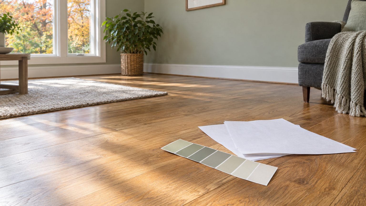

Don’t try to match the floor. Read its undertone, then pick a wall color that either contrasts with it or sits beside it without copying it. A wall painted the same tone as the floor tends to look flat, and a wall painted a clashing undertone makes the floor look worse than it is. The workable move is to identify what the floor leans toward (orange, yellow, pink, gray, green), choose a paint with a neighboring or neutralizing undertone, and test it at floor level before buying a gallon.
That approach works for wood, tile, vinyl plank, laminate, and carpet alike. The details change with the material, and so does the amount of damage a bad pick can do.
Start with the floor’s undertone, not its name
A floor listed as “oak” in the real estate description tells you very little. Two oak floors in two houses can look nothing alike, because species, stain, age, and finish all push the color somewhere different. What you need is the undertone, the quiet color underneath the obvious one.
The simplest check costs nothing. Lay a sheet of plain white printer paper on the floor in daylight and look at the floor next to it. Against pure white, a floor you called “brown” often reveals itself as orange, pink, yellow, or olive. Do the same with a white paint chip if you have one. Take the photo only as a reminder, since phone cameras correct color automatically and will flatter or flatten what you see.
Some patterns hold up across most homes. Red oak, common in houses built through the mid-20th century across the Northeast and Midwest, leans pink to orange. Hickory and maple run pale yellow to cream. Walnut can lean brown with a slightly purple or gray cast. Cherry and mahogany read red and deepen with age. Weathered or gray-washed boards tend toward cool brown or taupe.
Finish matters as much as wood. Oil-based polyurethane, widely used for decades, slowly ambers as it ages, so a floor finished in 2005 is probably warmer and yellower than it was the day it was installed. Water-based finishes stay much clearer. If you’ve been calling your floors “too orange,” part of that may be the coating, not the wood.
Scale also works against you. A typical 12-by-15-foot room has about 180 square feet of floor and roughly 430 square feet of wall, before you subtract doors and windows. The floor is a huge block of color that never leaves your peripheral vision. Paint that looked polite on a two-inch chip will read stronger across that wall, a point covered in Why the Color on the Wall Is Not the Color on the Chip.
Wall colors that work with common floor types
Think of the floor as a strong, fixed accent. The goal is for the wall to calm its loudest quality or accept it. Here is how that plays out in the floors most homeowners actually live with:
- Red or orange oak: muted greens, gray-greens, and creamy whites with a touch of yellow absorb the heat. Stark cool grays make the orange jump, and pinkish beiges make the whole room look rosy.
- Golden or honey wood: dusty blues, soft sage, and warm off-whites work well. Yellow-beige walls over yellow floors create a monotone that ages a room quickly.
- Cherry or mahogany: deep muted greens, warm taupes, and soft cream balance the red. Terracotta and brick tones pile red on red.
- Walnut or espresso: light warm whites and soft greiges make the darkness read as a deliberate choice. Deep navy or charcoal works if the room has strong daylight.
- Gray or weathered wood: warm whites, greige, and muted blues keep a gray floor from turning cold and institutional.
Those are starting points, not rules. A pale blue-gray wall next to a red oak floor looks calm in one house and chilly in another, and the difference is the light in the room, which we’ll get to.
Tile, vinyl, laminate, and carpet
Tile floors are common in Florida, Arizona, and Texas, where beige, tan, and travertine-look ceramic are standard. Many of them lean pink or yellow-tan, and the grout often leans a different direction than the tile. Look at both. If the grout is gray and the tile is warm beige, a warm white wall will pull toward the tile and make the grout look dirtier, while a soft greige will bridge them.
Vinyl plank and laminate fool people because they print several colors into each board. Pick the lightest and the most consistent tone you can see, and make that your reference point, not the darkest streak. Carpet is the trickiest of the group. A “neutral” beige carpet commonly carries a pink or greenish cast that only shows next to a true white. Check it while standing on it, because a carpet viewed from a chair looks different from the same carpet viewed from above.
Consider who uses the room, too. A kids’ bedroom floor takes a beating and its walls take scuffs, so a washable finish and a mid-tone color hides more wear than a pale one. In a home office, a strongly orange floor next to a glossy monitor can add glare and eye fatigue, so a slightly deeper wall helps the screen sit calmly in the room.
Test the color where the floor will actually touch it
Most paint mistakes happen because the sample was tested in the wrong place. A chip taped at eye level doesn’t show what the lower three feet of the wall will do, and that’s where floor and wall meet.
Floors reflect light upward. A sunlit orange floor casts a warm wash onto the base of the wall, which can tint a pale gray into peach near the baseboard while the same wall looks neutral near the ceiling. The effect is subtle in dim rooms and strong in bright ones.
A sample board solves most of this. Paint a piece of white poster board or foam core roughly two feet square, two coats, and set it on the floor against the baseboard, then lean it against the wall at eye level. Move it around the room over a full day. Check it in early morning, midday, late afternoon, and at night under your own lamps. Painting directly on the wall tells you about the sample, not the color, because the old paint underneath changes how new color reads.
Bulbs count. A warm 2700K bulb pushes everything toward yellow and orange, which amplifies a warm floor. A 5000K daylight bulb pushes things cool and blue. Test under the bulbs you plan to keep, because swapping them later will change the room as much as a repaint.
Light direction counts even more. In a north-facing room, where daylight is cooler and dimmer, a floor’s warmth can look more orange than it does anywhere else in the house, and cool paint colors can go dull fast. A North-Facing Room Cools Every Color You Put In It goes through how to compensate. A south-facing room does the reverse and tends to warm everything, so a color with a hint of gray or blue holds up better there than one with a lot of yellow.
One more tool deserves mention. Many manufacturers print a light reflectance value, or LRV, on the chip or list it on the product page. It runs from 0 for absolute black to 100 for pure white. You won’t find one for your floor, but you can estimate: a dark walnut floor sits low on the scale, a pale maple floor sits much higher. If you want contrast, choose a wall LRV well apart from the floor’s. If you want a quiet, tonal room, pick one closer to it.
When the floor still fights the wall
Sometimes the best wall color still doesn’t fix the problem. Before you consider ripping the floor out, there are cheaper moves that work in practice.
Baseboards are the first lever. Painting them a crisp white or a soft off-white draws a clean line between a strongly colored floor and the wall, so the two don’t blur into each other. Painting them the same color as the wall, in a satin or semi-gloss sheen, makes the floor itself the main event. Match the trim sheen to what’s already on the doors, since mismatched sheen shows more than mismatched color.
Rugs are the second. A large rug in a color that sits between the floor and the wall acts as a buffer, and it can cover the worst part of a floor you dislike. Choose one big enough that at least the front legs of the main furniture sit on it, which usually means 8 by 10 feet or larger in a living room. A small rug floating in the middle makes the floor look like a patchwork.
The third option is changing the floor itself without replacing it. Sanding and refinishing with a water-based finish can lift years of amber out of an old oil-based coat, and the result is often a noticeably lighter, less orange floor. It costs far less than new flooring, though sanding removes wood, so a floor can only take so many refinishes over its life. Stain is another route, but it commits you to a darker result, since stain goes on top of the existing wood color.
If none of that appeals, lean into the floor. A wall that quietly acknowledges one of its tones (a sage that picks up the green in a gray-brown plank, a cream that echoes the pale grain of maple) reads as intentional. The rooms that feel awkward are usually the ones where the wall tries to do something the floor doesn’t allow.
Last point on timing. If your floor was finished with oil-based polyurethane more than ten years ago, it has likely warmed since you last chose a color for the room, so a paint that worked when you moved in may look different now. Retest against the floor as it looks today, not the way you remember it. Browse more room-by-room guidance in Decor.