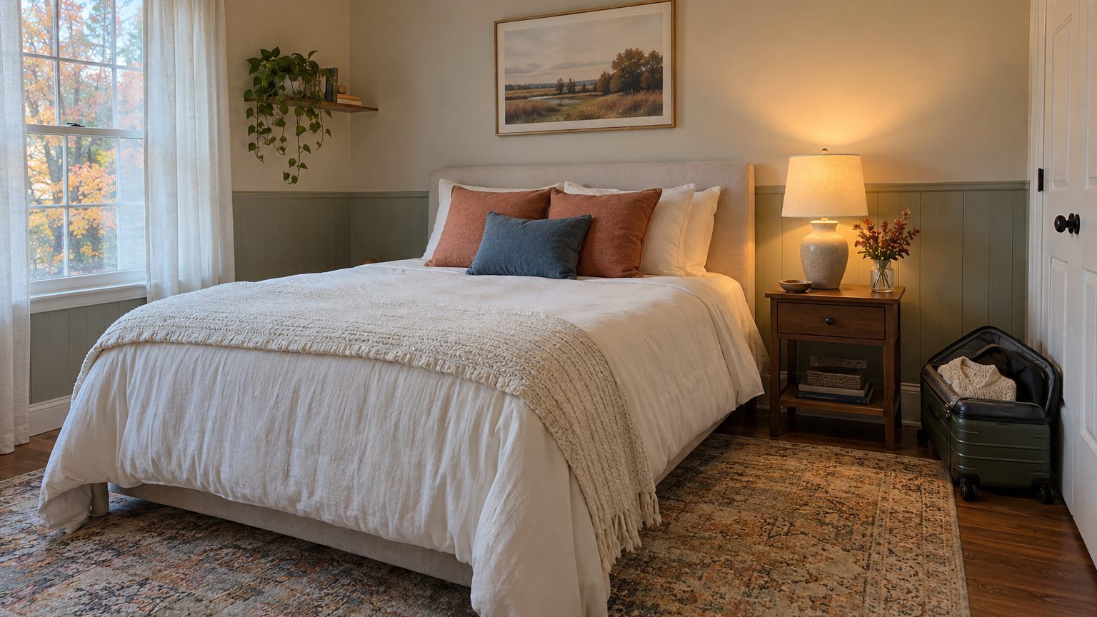

The best guest bedroom colors are soft, mid-light, and a little warm: greige, pale sage, dusty blue, muted clay, or an off-white with a creamy undertone. They hold up under lamplight, hide the nicks that come from rolling suitcases, and give a stranger to the house nothing to react to. That is the whole job. A guest room doesn’t need a personality statement, just a calm one.
The less obvious part is that a guest room isn’t painted for the person who owns it. It’s painted for someone who arrives after dinner, sleeps there a few nights, and leaves before the paint has had a chance to annoy anyone. That changes which colors make sense, and it changes how you should test them.
Paint for the Visitor, Not for Yourself
Think about when a guest actually sees the room. Most arrive in the evening, tired, with a bag in each hand. The first look happens under a bedside lamp or an overhead fixture, not in daylight. The second look is the next morning, groggy, with whatever light the window gives. Those two moments are the room’s entire audience, and they favor colors that stay friendly in low, warm light.
That rules out a few popular choices. Cool grays with blue or green undertones can turn flat and slightly chilly after dark, which is the opposite of the welcome you’re after. Stark builder white can feel clinical, like a waiting room. Very saturated brights (a vivid teal, a true red) tend to feel loud at 11 p.m. when someone is just trying to wind down.
A guest room also has a different relationship to time than the rest of the house. If the room hosts visitors for, say, 15 to 20 nights a year, it sits empty for roughly 345 nights. Nobody gets tired of a color they see for three weeks total. That is the argument for being a bit braver here than in a living room, and also the argument for staying quiet, because the room has no daily routine to anchor it. Both can be true. Pick based on what you want the room to do the other 345 nights.
Compare that to the main bedroom, where the color has to survive years of bad mornings, laundry piles, and your own mood swings. A primary suite rewards a long, careful decision. A guest room rewards a good decision made in a weekend. If you’re sorting out a whole house, the broader Decor section covers how those rooms fit together.
The Colors That Work, and Why
Warm neutrals lead the list because they flatter nearly every type of bedding a guest room might end up with, including the mismatched duvet from your college years. A greige with a faint yellow or pink undertone reads as soft rather than dull. A creamy off-white does the same job with more brightness, which helps in a small room with one window.
Muted greens come next. A gray-leaning sage or a soft olive tends to look settled in both daylight and lamplight, and it pairs well with wood furniture, which is what many guest rooms are furnished with (hand-me-down dressers, an old headboard). Green also sidesteps the gender and age associations that pink or navy sometimes carry, so a room can serve a college friend one weekend and your in-laws the next.
Dusty blues work too, with a caveat. Pick one with a bit of gray or green in it. A clean sky blue looks cheerful at noon and cold at night. A blue that leans slightly gray stays restful, and it echoes the calm, slightly nautical feel of many hotel rooms. Soft clay and blush tones round out the group, adding warmth to rooms that lack natural light. Keep them dusty, not candy-colored.
A short checklist helps when you’re standing in front of a hundred chips:
- Undertone leans warm, or at least neutral
- Saturation is low to moderate
- Value sits in the middle, not near white or black
- You can name the color without a marketing adjective
That last point is a good filter. If a chip’s name sounds like a cocktail, step back.
Why light reflectance value matters in a small room
Most paint companies publish a light reflectance value, or LRV, on a scale from 0 (absorbs all light) to 100 (reflects all of it). It’s usually printed on the back of the paint chip or listed on the product page. Colors in the 55 to 70 range tend to feel light without glaring, which suits a guest room that is likely your smallest bedroom. A color around 30 or below will make the same room feel snug, sometimes in a good way, sometimes not. The number won’t pick a color for you, but it keeps you from choosing a “light” shade that behaves like a dark one once it’s on four walls.
Let the Window Decide
Direction matters more than most people expect. A north-facing guest room gets steady, cool, slightly bluish light all day. Colors that look warm on the chip can go dull or gray there, so lean toward warmer neutrals with a little yellow in them, or accept a mood and embrace a deeper color. A south-facing room has bright, warm light for most of the day and can handle cooler greens and blues without feeling icy.
East-facing rooms are golden in the morning and cooler by afternoon. That’s pleasant for a guest who wakes early and a non-issue for one who sleeps in. West-facing rooms flip the pattern, with strong orange-gold light in the late afternoon and evening. That warm cast can push a peachy or yellow-leaning neutral toward something much more orange than you intended, so a slightly cooler or grayer version of your favorite usually looks better there.
Many guest rooms sit above a garage, at the back of the house, or in a basement with one egress window, and the light there is less predictable. A basement guest room with a single small window needs a color that holds its own under artificial light almost all the time. Choose something with real warmth and a lighter value, and plan on good lamps.
Bulbs count as much as the wall. Warm white bulbs, usually labeled around 2700K, make most paint colors look soft and inviting. Bulbs labeled daylight, around 5000K, will make the same wall look sharper and cooler. Using a mix across a room produces strange shadows. Match them, and test your paint under the bulbs the room will actually have.
Trim, Ceilings, and the Rooms That Do Double Duty
Many guest rooms have a second job: home office, sewing nook, exercise corner, a place where the treadmill sits under a quilt. A calm mid-tone neutral handles that overlap better than anything bold. It lets a desk and a bed share the same wall without arguing.
If the room is small and you want it to feel larger, painting walls and trim in the same color (or a very close one) blurs the edges and makes the ceiling line less abrupt. If you prefer a crisper look, a soft white on trim with a slightly deeper wall color gives definition. The decision deserves more attention than it usually gets, and the piece on trim, the color nobody chooses and everybody sees walks through the options and the sheen choices that go with them.
A guest room is also the one place in the house where a dark, enveloping color can work without much risk. Deep green, ink blue, or a charcoal with warm undertones can make a bedroom feel like a boutique hotel, and since the room is mostly used at night, the dark walls aren’t fighting daylight. The tradeoff is practical. A guest fumbling for a suitcase zipper in a dark room needs good lighting at the bed and the dresser, and a very dark ceiling plus dark walls in a small room can feel heavy to people who didn’t choose it. If you go dark, add a bedside lamp on each side and a bright, light-colored bedspread to give the eye somewhere to rest.
Ceilings are the quiet opportunity. A ceiling painted a shade or two lighter than the walls, rather than flat white, looks softer and avoids the stark line you get where a warm wall meets a bright white lid. Some people go further and tint the ceiling a pale version of the wall color. It’s a small move that makes a rental-grade room look finished.
How to Test Without Overthinking It
Skip the tiny chips. Paint a large sample, about two feet square, on two different walls, or use a peel-and-stick sample so you don’t have to touch up later. Put one near the window and one in the corner farthest from it. Look at them in the morning, at noon, at dusk, and under lamps. If the color survives all four, it will survive a guest.
Look at the sample next to what’s staying in the room. The bedspread, rug, and wood tones of the furniture will pull the color in one direction or another. A greige that looks perfect on its own can turn pink next to a reddish cherry dresser. A sage can look muddy beside orange pine. This is the step people skip, and it’s where most disappointing results start.
For finish, a matte or eggshell sheen is the usual choice on guest room walls. Matte hides wall imperfections and looks soft in lamplight. Eggshell has a little more wipeability if the room doubles as a kid’s overflow space. Glossier finishes show every flaw in older drywall and rarely belong on bedroom walls.
One last detail worth knowing: a neutral guest room has a practical afterlife. When a house goes on the market, a quiet, warm-leaning bedroom color photographs well and lets buyers imagine their own furniture there, so the paint you pick for visitors is also the paint that won’t need to be redone for the next owner.