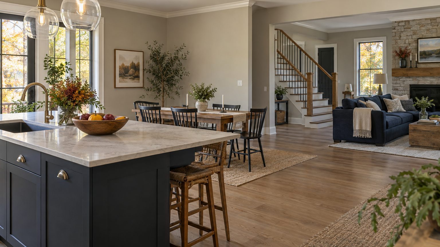

Paint your open plan in one main color, then let any change of color end at an inside corner, a built-in, or a ceiling line. Never end it in the middle of a flat wall. That rule covers most of what goes wrong in open plan paint colors. The remaining decisions are how many colors you can run (usually two or three, counting the trim white) and how to keep one shade from looking like three different ones as daylight moves across the room.
A combined kitchen, dining and living area can easily run 500 to 700 square feet, roughly the footprint of a two-car garage. Without doors to say “this room ends here,” your eye reads every wall at once. A color that looked fine on a bedroom wall can turn loud when it shares a sightline with a refrigerator, a sofa and a staircase.
Where paint can actually stop
In a closed room, the corners decide where color ends. Open plans lack those corners, so you have to find substitutes. Good stopping points share one trait: they are places where the surface itself changes, so a shift in color looks intentional rather than like a mistake.
Inside corners are the best. Where two walls meet at a recess, the shadow in the crease hides the tiny wobble of a brush line, and the eye accepts the switch without comment. A wall that steps back, such as a dining nook pushed out from the kitchen, gives you one for free. Outside corners are the opposite. Paint wraps around them, shows every edge, and chips first when a vacuum or a backpack catches it. If a color has to change at a protruding corner, end it on the side where the wall turns away from the room’s main view.
Other breaks work almost as well:
- A pony wall or the back of a kitchen peninsula, where the wall changes height
- The edge of built-in shelving or a cased opening, with the color wrapping into the jamb
- A soffit, beam or ceiling drop, which marks a change in plane
- The line between upper and lower walls, if there is a chair rail or wainscot
The mistake to avoid is the “floating stripe,” where a color stops at an arbitrary spot like the middle of a long wall or the edge of a rug. Without a physical edge, it reads as an error, and the room feels as if the painter ran out of paint. If you cannot find a natural break, extend the color to the nearest one, even if that means painting more wall than you planned.
Rooms with a lot of original wood complicate this. Stained beams, window casings and door trim cut across every zone in an open plan, so they function as a color all their own. If yours cannot be painted, the approach in A Room Full of Wood Trim You Are Not Allowed to Paint applies here too: choose a wall color that agrees with the wood’s undertone first, then worry about zones.
Build the palette from one family
The safest open plan scheme uses one undertone in different depths. Pick a base with a warm, cool or neutral undertone, then choose any second color from the same family, one or two steps darker on the same paint card. The two never fight, because they share a bias. A warm greige in the living area and a deeper warm greige at the kitchen end read as one idea. A warm greige next to a cool gray reads as a mismatch, and no amount of white trim fixes that.
Light reflectance value (LRV) is the number that keeps you honest. It runs from 0 (black) to 100 (pure white) and is printed on most manufacturers’ color cards and websites. Walls in the 60 to 75 range tend to feel airy but not stark. Dropping below about 40 gives you a moody, enclosing color, which is lovely in a small den and heavy across 600 open square feet. If two colors in your plan differ by more than 20 to 25 LRV points, you are making a high-contrast statement, and that should be a deliberate choice.
Light itself changes the picture more in open plans than in closed rooms. One end may have a wall of windows facing south while the other end sits 25 feet back and gets only borrowed light. The same paint will look lighter and warmer at the window end and flatter, grayer and darker at the back. North-facing light skews cool, so a gray with a blue undertone can turn icy there. Test large swatches (a 2-foot square on poster board or a primed patch of wall works) at both ends and look at them in morning, midday and evening, with lamps on. Sample pots cost a few dollars, which is a bargain next to repainting 700 square feet.
Sheen belongs in the plan too, and it is the detail people forget. The same color in flat and in satin looks like two different colors, because shinier paint bounces more light. Keep walls at one sheen throughout, typically matte or eggshell, with a flat ceiling and a satin or semi-gloss for trim. Changing sheen to mark a zone is a way to create an accidental color mismatch.
Three layouts, three approaches
Most open plans fall into a few patterns, and each one points to a different answer.
Kitchen, dining and living in one rectangle
This is the classic. Run one main wall color across the whole thing and let the cabinets, island and furniture supply the contrast. If you want a second color, use it in the kitchen, but confine it to a recessed section, such as the wall behind open shelves or the back of a pantry bump-out, and end it at the inside corners on both sides. A deeper shade of the main color is a better bet than a different hue. The kitchen has the most surfaces competing for attention (appliances, backsplash, countertops), so it usually needs the calmest wall.
Ceilings deserve a decision as well. In a long open space, painting the ceiling the same white as the trim keeps the room from breaking into a patchwork. A ceiling tinted to about half-strength of the wall color can soften a very tall room, but it works best when the ceiling is continuous and not interrupted by beams or soffits.
Open plan with a stairway or hallway in view
Stairs add a vertical wall that is visible from nearly every spot below. Many homeowners treat that wall as a place for bold color, and it can work, but a wall that tall carries a lot of visual weight. The cleaner option is to continue the main wall color up the stairwell and put the contrast in the railing, the runner or the artwork. If you do want a deeper shade, stop it at the landing or the point where the ceiling line changes. A color that ends halfway up a stairwell wall tends to look unfinished.
One corner that belongs to someone specific
A homework corner, a play zone or a desk nook is where people tend to want a different color, because the person using it has a different life than the rest of the room. Resist painting the whole nook unless it is truly recessed. A better move is to keep the walls in the main palette and let the zone show up in the furniture, rugs and shelving. When a child’s space opens onto the shared room, start with the thinking in Paint Colors for a Boy’s Room, Past the Obvious Blue and then pull the family-friendly color toward the shared undertone, so the corner feels related to the room it opens onto.
A bold accent without breaking the room
One deep or saturated wall can anchor an open plan, and the choice of wall matters more than the choice of color. The best candidates are walls that face the main seating area, sit at the end of a long sightline, or form a three-sided recess. The worst are walls you see at an angle from the kitchen and the front door at the same time, because they dominate everything. A quick test: stand where you spend most of your time and where guests first walk in. If the accent wall is the first thing you see from both, it will define the whole space.
Keep the rest of the plan quiet. A saturated wall already uses up the room’s one big color decision, so the neighboring walls should stay in the same light neutral family, and the trim should stay white or close to it. The deep color will look intentional if it ends at inside corners on both sides and if the ceiling stays light.
Some people rule out any contrast by painting everything, walls, trim and ceiling, in one color. That is a legitimate move in a space with plenty of light, and it can make an open plan feel quiet and cohesive. It also removes any visual relief, so it needs texture to avoid looking flat: wood, woven fabric, matte metal. For more ideas on how those finishes and furniture choices work together, browse the rest of the Decor section.
One last practical detail: buy enough paint from a single batch for the full space, or have the store mix all the cans at once. A 600-square-foot open plan with 9-foot ceilings can easily cover 1,000 square feet or more of wall, and slight variation between separate mixes shows up most on long, uninterrupted walls, where nothing breaks the line and your eye can compare one end with the other.