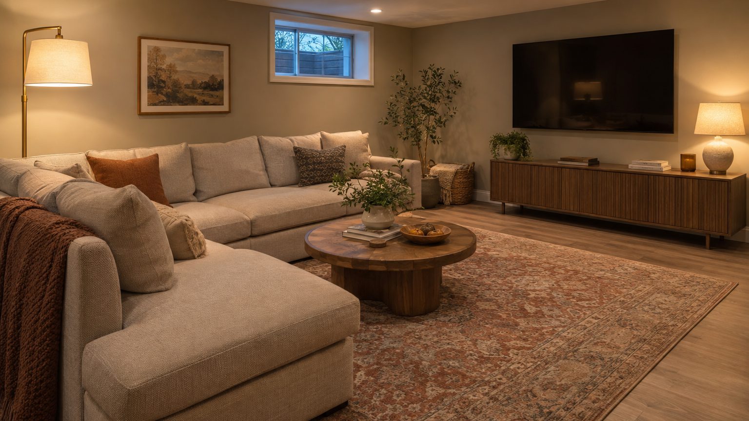

The best basement paint colors are mid-light, warm-leaning shades with a Light Reflectance Value (LRV) of roughly 55 to 75, painted in a matte or eggshell finish and tested under the bulbs you actually plan to use. Stark white looks chilly without daylight, and deep colors work only when the room is built around lamps and a screen. A basement has little natural light to work with, so the color has to be chosen for the artificial kind.
That sounds like a small distinction. It changes nearly every decision, from which swatch you pick to what time of day you hold it up to the wall.
Why a basement changes how paint looks
An upstairs room gets light from several directions that shift through the day. A finished basement usually gets a few small windows set high on one or two walls, often looking into a window well that blocks part of the sky. The light that does arrive is thin, indirect and mostly from one side. By midafternoon in many homes, the room is running on fixtures.
Paint has no light of its own. It reflects what lands on it, and the color you see is whatever part of the spectrum the wall bounces back. Under a 2700K bulb (the warm, amber glow of a traditional incandescent), a gray with a hint of blue will read flatter and often greener. Under 4000K or 5000K LEDs, the same gray can turn cold and a little clinical. Most basements live under a mix: a few recessed cans, a lamp or two, maybe a strip of under-cabinet lighting at the wet bar. Each source tints the walls differently.
The LRV number printed on the back of most paint chips helps here. It runs from 0 (absorbs all light) to 100 (reflects all of it). Bright white trim paint sits in the high 80s. Typical mid-tones fall between 40 and 60, and a deep navy or charcoal can sit under 10. In a basement with little daylight, a wall at LRV 15 swallows a large share of the little light available, so the room feels smaller and the fixtures have to work harder. A wall around 60 to 70 returns enough to keep things open without going stark.
Recessed lighting adds its own quirk. Cans placed close to a wall throw bright scallops of light down the surface, which exaggerates every roller mark, drywall seam and patched nail pop. Flat or matte finishes soften that effect. Glossier sheens advertise flaws, and in a room lit mostly from the ceiling, they will.
Matching color to how the room is used
Most families use a basement for one or two main jobs. Picking by occupant and activity, rather than by whatever looked good in a catalog, keeps the color from fighting the room.
Family rooms and general living space
For a space where people spend long evenings, warm neutrals do the most work. Soft creams, light greiges, and sandy beiges with a yellow or red undertone make a lamp-lit room feel inviting instead of cave-like. Look for an LRV in the 60s or low 70s. A pale warm gray works if the undertone leans toward beige rather than blue, because blue-based grays tend to go cold once the sun is gone.
Soft greens and muted blue-greens with some gray in them also hold up well. They read as calm, they photograph fine, and they pair with the wood or laminate flooring found in many basements. A pale sage, for example, picks up warmth from lamps while still feeling like a color rather than an absence of one.
Media rooms and home theaters
This is where dark colors earn their place. If the main goal is a good picture, light-colored walls bounce screen light around the room and wash out contrast, particularly in the corners nearest the screen. Deep charcoal, dark navy, forest green or a warm chocolate in a flat finish absorb stray light and make the room feel intentional. Dark paint can look fantastic in a basement because there is no competing daylight to expose it.
A caution, though. Dark walls hide less than people expect. They show dust, scuffs and roller texture, and they take more coats to cover evenly. Painting only the screen wall and the side walls dark, while keeping the ceiling a lighter flat color, keeps the room from feeling like a bunker.
Playrooms, gyms and workshops
Rooms with hard daily use call for durability as much as hue. In a playroom, a washable satin or scrubbable matte on the lower half of the wall pays off, and the same logic about surface over color applies in A Toddler’s Room: The Color Comes Second to the Surface, which is worth a read if small kids will be sharing the space. A home gym benefits from light, slightly cool tones (a pale gray-blue or soft white) because they feel fresh and make the mirrors do their job. A workshop corner should lean bright, with an LRV above 70, since detailed work needs every bit of reflected light you can get.
Guest bedrooms and basement offices
If the room doubles as a bedroom, check the egress rules before you think about color. The International Residential Code, which most states adopt with local amendments, requires an emergency escape opening in basement sleeping rooms: a net clear opening of at least 5.7 square feet, at least 24 inches high and 20 inches wide, with the sill no more than 44 inches above the floor. Those same windows are your best daylight source, so keep the paint near them light and clear of heavy curtains.
For offices, a muted color with a bit of depth, such as a dusty blue-green or soft taupe, reduces glare on monitors better than white. Video calls are easier too, since a mid-tone wall behind you looks more natural on camera than a blown-out white.
Walls, ceiling, trim and the stairwell
White ceilings are the default for good reason: they bounce the light from recessed fixtures back down into the room. A basement ceiling is often only 7 feet or a little more, so a pure flat white (with an LRV in the 80s) keeps that low plane from pressing down. Painting walls and ceiling the same pale shade blurs the edge where they meet and can make the ceiling feel higher, but it only works in lighter colors.
Trim does not need to be crisp white. In a warm room, a soft white or one step lighter than the wall looks more cohesive, and it hides the gaps and wobbles common with basement framing. A semi-gloss or satin trim finish wipes clean, which matters around floors where moisture and dirt gather.
Then there is the stairwell, the only part of the basement that most visitors move through quickly and under a single light source. It is a transition zone between the brighter main floor and the dimmer lower level, and it benefits from a color that echoes both. Choose a shade that sits in the same family as the upstairs hall, and a little lighter than the basement living area, so the descent feels like a continuation rather than a drop. The thinking in A Hallway Is Seen in Motion and Touched Every Day applies almost directly: pick a washable finish, expect scuffs at hand height, and judge the color while walking past it, not standing still.
For a wider look at how occupants and light shape every room’s palette, the Decor section collects the related guides.
Moisture, prep and testing before you commit
Below-grade walls get damp in ways upstairs walls do not, and paint will not fix that. Concrete and block are porous, and moisture moving through them pushes paint off the surface. Before any color goes on, run a simple test: tape a 2-foot square of clear plastic sheeting tightly to the wall, sealing all four edges, and leave it for 24 to 48 hours. Moisture beneath the plastic means water is coming through the wall. Moisture on the room side of the plastic means the room is humid. Either result needs solving first, through grading, gutters, a dehumidifier or a drainage fix, because paint over a wet wall will blister and peel.
The EPA recommends keeping indoor humidity ideally between 30 and 50 percent to limit mold growth. A small hygrometer costs little and tells you a lot about whether the basement is ready for a finish.
Surface prep varies by what you are painting:
- New drywall: prime with a drywall primer so the joint compound and paper absorb paint evenly, then paint.
- Bare masonry: clean off dust and any white, powdery efflorescence with a stiff brush, let the wall dry fully, then use a masonry primer or a product made for concrete.
- Previously painted walls: wash, scuff-sand glossy spots, spot-prime stains and patches, then paint.
Choose a low-VOC or zero-VOC paint. Basements have limited air exchange, and fumes linger longer than they do upstairs. Run a fan or open the egress window while painting, and give the room extra drying time before closing it up.
How to test a color properly
A tiny chip tells you very little. Paint sample boards or large swatches about 2 feet square, and tape them at a few spots: next to the window, in the darkest corner, and across from the main light. Look at them in the morning, in late afternoon, and at night with your normal lamps and overheads on. The color that works at all three times is the one to buy.
Pay attention to the bulbs, too. Matching color temperature across the room matters more than most people realize. Mixed bulbs (one cool, one warm) will make any paint look inconsistent. For living areas, 2700K to 3000K LEDs suit warm paint, and a color rendering index (CRI) of 90 or higher keeps colors true. If you plan to change bulbs, do it before you test, not after you’ve already rolled on two coats.
One last nuance: sample colors on the wall, not on a piece of white poster board. The surrounding colors, such as flooring, trim and the neighboring wall, shift how a shade reads. In a room with borrowed light, those neighbors have an outsized effect, since every surface is passing around the same small amount of illumination.
A few windows aside, the most reliable upgrade in many basements is not a new color at all but a better bulb. Swapping in higher-CRI LEDs at a consistent color temperature will often change how a paint looks more than moving a full step on the swatch deck.