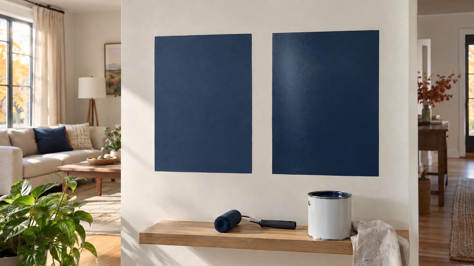

Yes, sheen changes how a paint color looks, and the shift is big enough to notice from across a room. The pigment is identical in a gallon of flat and a gallon of semi-gloss. What differs is the surface the dried paint leaves behind. A glossier film looks deeper and richer when you view it straight on, then throws glare at certain angles. A flatter film looks lighter, softer and a bit chalky, with no glare at all. Put the same navy on two boards and you’ll swear you bought two colors.
Why one formula looks like two colors
Light that hits a painted wall does two things. Some of it passes into the paint, gets filtered by the pigment, and bounces back as the color you chose. The rest bounces off the very top of the film without ever touching a pigment particle. That second bounce is white light, and it sits on top of your color like a thin veil.
Sheen controls how that veil behaves. Gloss paint dries to a smooth, tightly packed surface, so the surface reflection leaves in one concentrated direction, like a mirror. Step out of that narrow angle and the veil is nearly gone, so you see the color with more depth and saturation. Flat paint dries with a microscopically rough surface, partly because it carries more pigment and less resin binder. That roughness scatters the surface reflection in every direction, so a little white haze reaches your eyes from everywhere. The color reads lighter and less saturated, though it also looks calm and even.
The industry measures this with a gloss meter, a standard test method (ASTM D523) that bounces light off a dried paint film at set angles, commonly 20, 60 and 85 degrees. Low angles like 85 degrees are used for flatter finishes because they pick up the faint sheen that a steeper angle would miss. Higher gloss units mean a more mirror-like surface. The key point is that sheen is a physical property you can measure, not a marketing mood.
Dark and saturated colors show the gap most. A deep green or charcoal in flat can look almost dusty, as if someone lightly sanded the color, while the same shade in satin looks like it has an extra layer of ink. Pale colors shift too, but the change reads more as a difference in softness than in depth. Whites and creams in a high sheen pick up the color of whatever sits nearby (a green yard outside a window, a red sofa) because the surface is partly acting as a mirror.
What each sheen does to a color in an actual room
Paint makers each use their own names, but the ladder from least to most reflective usually runs flat or matte, eggshell, satin, semi-gloss, then gloss. Here is how that plays out on a color once it’s on the wall.
Flat and matte hide the most. Roller marks, patched drywall seams and slightly wavy plaster all disappear under a diffuse surface, which is why flat remains the standard ceiling finish. The color looks its lightest and most velvety. The trade-off is durability: flat films are porous enough that a scrubbed fingerprint can leave a burnished patch, and in a dark color that patch shows as a pale or shiny smudge. Many manufacturers now sell washable matte formulas that close part of the gap, but a hallway where kids drag backpacks along the wall still punishes ultra-flat paint.
Eggshell and satin sit in the middle and handle most living areas well. Eggshell adds a soft glow without drawing attention to the surface. Satin has enough gloss to wipe down after a spill, and it makes mid-tone colors look a notch deeper than they do in flat. In a kitchen or a child’s room, where walls get splashed and touched, this is the range most people end up in. In a bedroom, many people prefer eggshell because lamp light at night skims across the wall at a low angle, and satin will show every brush stroke in that raking glow.
Semi-gloss and gloss make color look the most saturated and the most reflective, with real glare when a window or a lamp sits opposite the wall. They are the standard on trim, doors and cabinets because they resist moisture and scrubbing. Used on large walls, they act like a flaw detector. Every nail pop, sanding scratch and uneven patch catches the light. The same defect that vanishes in flat becomes a visible ridge in semi-gloss.
Light direction decides how much of this you actually see. A window on the opposite wall sends light skimming across the paint, and sheen differences jump out. Light from overhead recessed cans hits the wall at a steep, scattered angle and softens them. Warm lamps at dusk will pull a satin wall toward amber in the bright patch and leave the rest of the wall cooler, which can look like two different paints on one wall. That interaction is part of why color choices that look right at noon fall apart at 7 p.m. People who repaint soon after finishing often discover the problem there, a pattern that comes up in The Colors People Repaint Within a Year.
Rooms with no daylight behave differently again. With no window, nothing but fixtures lights the walls, so the sheen reflects those fixtures instead of the sky. In that setup a high sheen can produce hot spots right under the lights, while a flat finish keeps the color uniform. The full logic is laid out in A Room With No Window: The Light Is Whatever You Install, and sheen is one of the first variables to settle there.
Who uses the room matters as well. A nursery, a mudroom and a home office all sit on different parts of the ladder. A nursery wall that gets wiped nightly after spit-up wants a washable satin or eggshell. A home office with a monitor and a desk lamp wants the opposite, because glare on a wall in the line of sight of a screen causes eye strain, and a flat or matte wall absorbs that. Pets leave nose prints and tail-height scuffs, so the lower few feet of a wall may justify more sheen than the area above it.
Testing a color in the sheen you will actually use
The paint chip in the store tells you less than you’d expect. Chips are usually printed or coated in a single finish, often something close to a satin or semi-gloss sheet, so they say nothing about how the flat version will dry. Even a brush-out of the wrong sheen will mislead you. Here is a short routine that avoids the surprise:
- Buy the sample in the same sheen as your final choice, not whatever the sample pot happens to come in.
- Paint two coats on a large white poster board or a 2-foot square on the wall, with a white border around it so your eye isn’t comparing against an old color.
- Check it at midday, at dusk with your lamps on, and again at night, and look at it from the door and from the opposite corner.
- Tilt your head, or crouch, until a window or lamp reflects in the swatch. That angle is the glare you’ll live with.
Give the sample a full day to dry before judging it. Most latex paints continue to shift slightly while they cure, and a wet-looking swatch is darker than the finished result. The shift is usually modest, but it’s enough to cause an argument over whether the color “came out wrong.”
One more variable sits behind the counter. Paint stores tint color into a base, and the base is different for each sheen. A flat and a satin of the same named color can have slightly different tint loads and slightly different binders, so even a measured, perfect match has small differences. Good manufacturers formulate each base to land close, but not identical. If you’re buying the same color in two sheens, say for walls and trim, have both mixed at the same store on the same day and compare them side by side before you open a roller.
Using sheen on purpose: one color, two finishes
Designers use this effect deliberately. Painting walls in flat and trim in semi-gloss, both in the same color, gives you a room that reads as tonal rather than matched. The trim looks a half-step deeper than the wall, and the room gets depth without adding a second hue. It works especially well in dark colors, where the gloss on the door casing catches light and the wall stays quiet. In small spaces and powder rooms, you can cover walls, trim and even the ceiling in one color and let the sheen do the separating. Some people choose it because it is more forgiving than a contrast scheme if the color isn’t quite right.
The other common application is ceilings. Paint a ceiling in flat, and it disappears. Paint it in satin or eggshell, and it bounces light back into the room, which helps when you have little daylight but also exposes every seam and roller lap. A flat ceiling also hides stains and old patches better, which is why most painters reach for it by default.
Touch-ups are where sheen punishes careless planning. A flat wall can hide a small dab of fresh paint if the color matches, but a satin wall often shows a dull or shiny patch even when the color is right, because the new coat dried at a different thickness and with a different surface. That patch is called flashing. If you expect heavy wear and ongoing repairs, choose a sheen that forgives patching, and keep a labeled jar of the leftover paint in the same finish. Repainting a whole wall, corner to corner, is usually the cleaner fix than spot repair.
Finally, don’t assume sheen names are consistent across brands. One company’s satin can measure close to another’s eggshell, and some lines skip rungs on the ladder entirely, or add their own, such as “pearl” or “velvet.” If a manufacturer’s technical data sheet lists gloss units at 60 or 85 degrees, that number is a better guide than the name on the can, and it’s worth checking before you commit to a color in a finish you can’t compare in person.