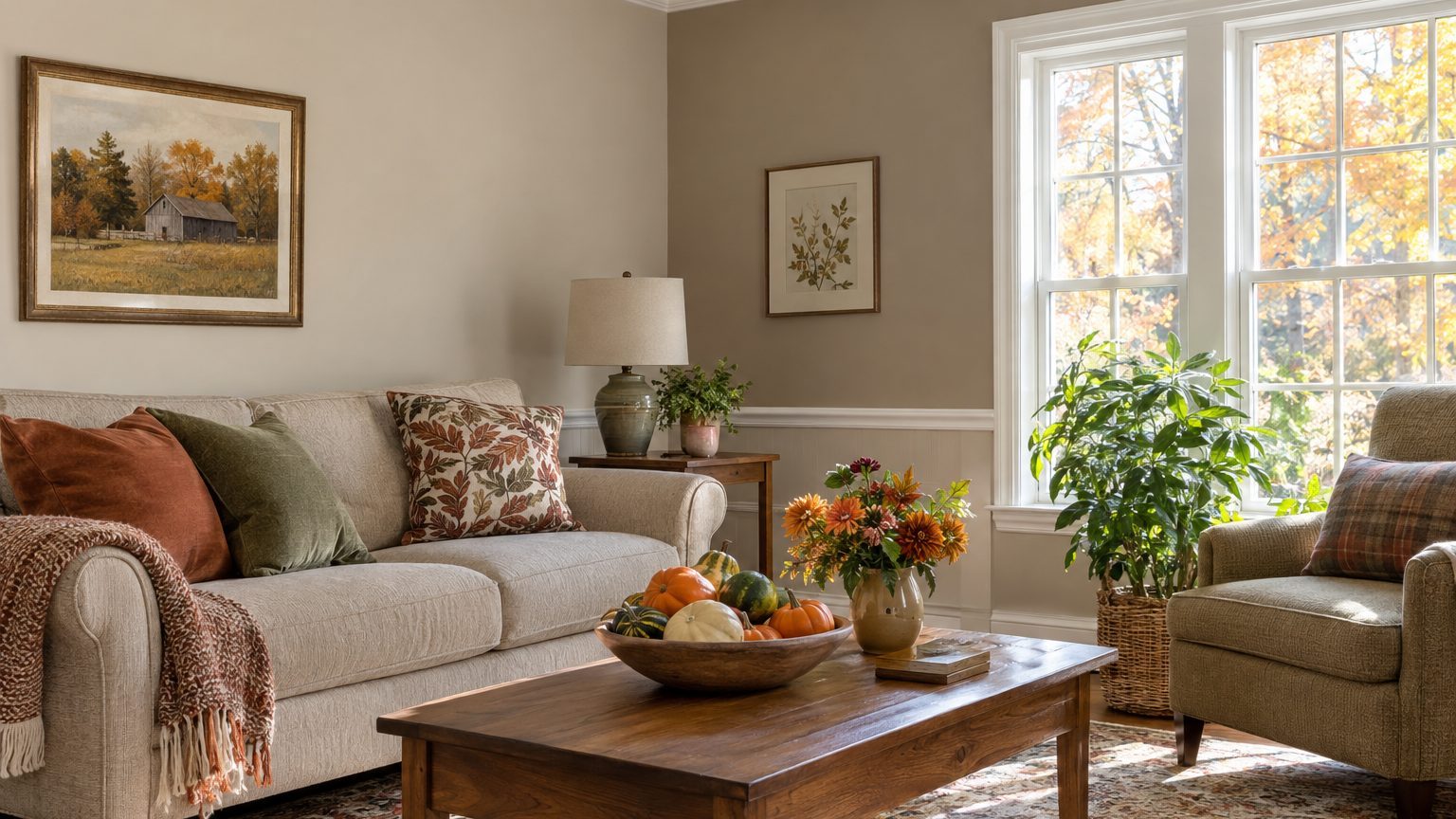

Two paint colors can share a room without splitting it in half if they have the same undertone, sit a modest step apart in lightness, and change at a spot the room already marks, such as an inside corner, a chair rail, or the ceiling line. Get those three things right and the second color reads as depth. Get them wrong and the room looks like two rooms that had an argument.
Most failed two-tone rooms break one of those rules, and usually it’s the last one. A wall that changes color halfway across a flat surface, or on an outside corner, looks like a painter ran out of paint. The rest of this article covers how to choose the pair, where to put the break, how to check it against your actual light, and how to get a crisp line.
Choosing a pair that belongs together
Undertone comes first. A gray can lean blue, green, or purple. A beige can lean pink, yellow, or green. Put a pink-leaning greige beside a green-leaning one and the eye reads a clash even when both colors look neutral on their own. The fix is to hold the undertone constant and move something else. Paint companies group colors by family for this reason, and the strips on a fan deck give you a head start. Colors on the same strip share an undertone and differ mostly in depth, which makes them the safest pairing.
Value is the second lever. Every paint has a light reflectance value (LRV) on a scale from 0 (black) to 100 (pure white), and manufacturers print it on the back of the swatch or list it on their websites. A common rule of thumb is to keep the two colors somewhere between 10 and 25 points apart for a quiet, cohesive look. Closer than that and the difference looks accidental, as if one wall faded. Much farther apart gives you real contrast, which suits a bold accent but needs a clear reason to be there.
Sheen counts more than most people expect. A wall in matte and a chair rail section in satin can look like different colors even if the tint is identical, because the glossier surface bounces light back differently. Many painters use flat or matte on walls, a slight step up on trim, and a flat ceiling paint overhead. Keeping that pattern consistent between the two colors means the sheen is doing its usual job and not introducing a third variable.
The fixed items in the room deserve a look too. Flooring, countertops, and built-ins have undertones you can’t change, and your paint pair has to get along with them. The same logic applies when you’re working around a floor you aren’t replacing, and Matching Paint to a Floor You Are Not Replacing walks through that part in detail. For general inspiration beyond this one question, the Decor section collects related guides.
The 60-30-10 split, applied to paint
Designers often use a 60-30-10 proportion as a starting point: roughly 60 percent of the visual field in a dominant color, 30 percent in a secondary one, and 10 percent in an accent. For a room with two paint colors, that translates well. The main color takes most of the wall area, the second color covers a defined zone (lower walls, one wall, or the ceiling), and fabric, art, and wood supply the accent. It’s a guideline, not a law, but it explains why 50/50 splits tend to feel unsettled. When two colors compete for equal area, nothing leads.
Where the line goes
Paint should change where the architecture already changes. That’s the whole principle, and several layouts honor it.
Inside corners. Where two walls meet in a recessed corner, the paint can stop cleanly, because the corner makes a natural shadow line. Outside corners, the ones that stick out into the room, are a bad place to switch. The color edge lands right where the eye goes, and any wobble shows. A single accent wall works for exactly this reason when it’s a full wall between two inside corners, such as the wall behind a bed or the wall a sofa backs onto. It works poorly when it’s a wall that juts out or wraps around a column.
Chair rails and wainscoting. A horizontal split gives you a darker color below and a lighter one above, which grounds the room the way heavier shoes ground an outfit. Traditional chair rails sit about 32 to 36 inches off the floor, and a common proportion puts the break at roughly one third of the wall height. In a room with 8-foot (96-inch) ceilings, that lands around 32 inches. Putting the divider at the exact midpoint of the wall chops the room in two, so aim higher or lower than center. If your walls don’t have a physical rail, you can add a thin piece of molding and paint on either side of it, which hides the line better than tape alone.
The ceiling. The most overlooked second color is overhead. A ceiling tinted to a pale version of the wall color, often the same hue at a lighter value, adds warmth without drawing attention. A deep color on the ceiling can make a tall room feel cozier, though it will lower a standard 8-footer noticeably and eat light in a small one. Whatever you choose, the ceiling meets the wall at a clean corner, which is one of the easiest breaks to cut in.
Trim, doors, and built-ins. Painting a bookcase, a window trim set, or a door in a deeper shade of the wall color is a lower-risk way to introduce a second color. The break follows the object’s edge, so there’s no question where the paint should stop.
Open-plan spaces add a wrinkle. When a kitchen, dining area, and living room share sightlines, the colors you choose are all visible at once, and a break at a doorway or a half wall can double as a boundary. In those layouts, keep every color in the same undertone family and let value or one accent hue carry the difference between zones.
Testing against your own light and your own occupants
Paint chips lie. A swatch under hardware-store fluorescents tells you almost nothing about how the color will look on your wall at 4 p.m. in February. Light direction changes everything. North-facing rooms get cooler, bluer, more even light, and they tend to make grays look colder and flatten warm colors. South-facing rooms get warmer, stronger light through the day, which can wash out a pale color or make a saturated one look brighter. East rooms glow in the morning and cool off after lunch, and west rooms do the reverse.
With two colors, test both on the same wall, side by side, at the actual height where they will meet. Brush samples onto large boards (two feet by two feet is a reasonable minimum) or use peel-and-stick samples, and move them around the room. Check them in morning light, midday, evening, and with the lamps on. Bulb temperature matters too: a 2700K bulb gives a warm yellowish cast, while a 4000K or 5000K bulb reads cool or daylight-like, and the same paint will look like a different color under each. Keep the bulbs you plan to use in the room while you evaluate.
The people using the room should drive some of these choices. A bedroom for sleeping benefits from lower contrast and softer values, so the break between colors feels calm, not busy. A child’s room can handle more contrast, and a lower-wall color has a practical side because scuffs hide better on mid-to-deep tones. A workspace asks for something different again. If you spend long hours in the room, glare and contrast affect eye comfort, and A Home Office You Sit In for Eight Hours covers how to keep a two-tone scheme from becoming tiring. Rooms where family gathers in the evening, on the other hand, often look best with the darker shade on the walls, where warm lamplight makes the color feel enveloping instead of heavy.
One trap is to evaluate the darker color only in daylight. Deep tones can look rich at noon and nearly black at night in a room with limited artificial light. If the room has a single overhead fixture, plan on adding lamps before committing to a dark second color.
Getting a clean line
Order of operations saves time and frustration. Paint the ceiling first, then the lighter wall color, then the darker one. Lighter paint covers a darker edge poorly, so it’s easier to apply the dark color over a dry light base than the reverse. Wait for the first coat to cure to the touch, usually several hours for latex, and check the can for recoat guidance before taping.
For a straight horizontal or vertical break, snap or mark a level line first. Even in rooms where the floor or ceiling slopes, which is common in older houses, a laser or a long level beats trusting the trim. Press the edge of the painter’s tape down firmly, then run a thin coat of the base color over the tape edge. That seals the gap, so any paint that seeps under the tape is the base color and stays invisible. Apply the second color, and pull the tape while the paint is still slightly tacky, pulling at a low angle away from the fresh line. Waiting until the paint is fully dry can tear a ragged edge, especially with a thick second coat.
Where walls meet trim or a rail, a thin bead of paintable caulk fills gaps and gives the paint a crisp surface to end against. Textured walls complicate tape because paint creeps into the grooves. In that case, cutting the line freehand with an angled brush often looks better than a taped line that gets slightly fuzzy.
Homes built before 1978 may have lead-based paint under the surface layers. If your plan includes scraping or sanding at the break line, check EPA guidance on lead-safe work practices before you start, and use a test kit to confirm.
Last, a small batch issue that catches people out: two cans of the same color can differ slightly from one mix to the next. If the first color covers several walls and needs more than one gallon, pour the cans together in a large bucket and stir before painting, a step painters call boxing. It takes five minutes and prevents a faint patch where one can ran out and the next began.