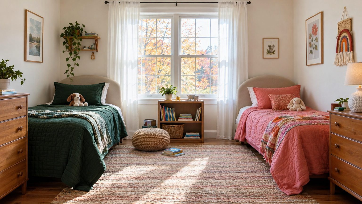

The shared kids room colors that hold up best share a quiet base on the walls, and then give each child a defined zone of their own color. Pick two accent colors with the same undertone and similar depth, and the room reads as one space even when one child wants forest green and the other wants coral. Paint the whole room in a compromise nobody loves, and you get two unhappy kids instead of one.
That’s the short version. The longer one depends on three things: how much wall you actually control, how much daylight the room gets, and how far apart the two children are in age. A nursery-to-kindergarten pairing is a very different job than a 7-year-old sharing with a 14-year-old. For more ideas across the house, the Decor section covers room-by-room color thinking.
Start with a base both kids can live with
Walls are the largest surface in the room, and they are the worst place to settle an argument. A base color should be the one thing neither child has strong feelings about. Soft warm whites, pale greige, light putty, and muted sage all fit that description. They also make the room feel bigger, which matters when two beds, two dressers, and two sets of belongings share one footprint.
Light reflectance value (LRV) is the number worth knowing here. Paint brands list it on the back of most color chips or on their websites, on a scale from 0 (absorbs all light) to 100 (reflects all of it). A base in the 60 to 80 range bounces plenty of light around a small bedroom. Drop below 30 on all four walls and a room with one modest window can feel like a cave by 4 p.m. in November.
A pale base is not the same as a boring one. The trick is to choose it with undertone in mind. If one child loves a warm terracotta and the other a cool sage, a base with a slightly warm gray bridges them. A stark blue-white would make the terracotta look dirty and the sage look icy. Hold the chips side by side before buying anything, and check that the base doesn’t pull toward pink, green, or lavender in the room’s actual light.
One more consideration: sheen. Kids’ rooms take scuffs, crayon, tape residue, and the occasional flying sneaker. Eggshell or satin finishes wipe clean far better than flat paint, and they work fine on a calm base color. Save the flat finish for the ceiling.
Give each child a zone, not half the room
Splitting a room down the middle with two different wall colors sounds fair. In practice it often looks like a border dispute. Unless the room has a natural break (a chimney breast, a closet bump-out, a change in wall plane), a straight line of green meeting a straight line of orange feels arbitrary, and one child inevitably gets the sunnier half.
Zones work better. A zone is the area a child controls: the wall behind their bed, their desk nook, their side of a shared closet door, their bedding and lamp. Within it, they get real say. Outside it, the shared base rules. Designers often lean on the 60-30-10 guideline, which is a rule of thumb and not a law: roughly 60 percent dominant color, 30 percent secondary, 10 percent accent. In a shared room, the base takes the 60, the two children’s colors split the 30 and the 10 in whatever way you can make roughly equal.
Equal matters more than you’d think. Kids notice who got the bigger wall. If one child’s headboard wall is 10 feet wide and the other’s is 6 feet, trade something back, such as the better window seat or the larger bulletin board.
Choosing two colors that belong together
Two kids, two favorites, and no obvious match. Three pairing methods rescue most of these situations:
- Same hue, different depth. A pale sky blue for one child, a deep navy for the other. They look intentional together because they share a family.
- Same undertone, different hue. Dusty rose and sage green both have a gray cast, so they sit comfortably side by side, even though they are nowhere near each other on the color wheel.
- Same saturation, different temperature. A muted teal and a muted mustard, say. Brightness is what makes colors fight, and when both are dialed down they cooperate.
The failure case is a loud primary next to a muted tone. Fire-engine red beside dusty lavender makes the lavender look washed out and the red look louder than it is. If one child wants bold, the other child’s color needs enough weight to hold its own, or the bold color should be limited to smaller items like a bedspread or a lampshade.
Parents hunting for ideas beyond the default blue-for-boys, pink-for-girls pairing may like the approach in Paint Colors for a Boy’s Room, Past the Obvious Blue, which breaks down how deeper greens, rusts, and inky shades behave in a child’s space. Most of those colors translate well to a shared room.
Bunk beds, rentals, and other awkward setups
Bunk beds change the geometry. The child on the top bunk sleeps a couple of feet from the ceiling, so the ceiling is effectively part of their zone. A soft tint of their color overhead (a pale blue, a whisper of blush) can make the top bunk feel less like a shelf. The bottom bunk child, meanwhile, spends their time in a shadowed alcove, where a lighter, warmer color or a stick-on light helps more than any paint choice would.
Renters face the opposite problem: walls that cannot be repainted. Peel-and-stick wallpaper, removable decals, and fabric panels or large tapestries hung on tension rods let each child claim a wall without risking the deposit. Rugs are an underused tool here. Two different rugs, each under one bed, mark territory clearly and cost far less than a repaint. Check the product’s removal instructions first, because adhesives behave differently on textured walls and on older paint.
Furniture can do the dividing too. A low bookcase set perpendicular to the wall separates sleeping areas physically, and each side can lean toward its own color without a hard paint line ever appearing. This is the cleanest fix when two kids differ wildly in taste but share a modest square footage.
Check the colors against the room’s light
Paint is not one color. It is whatever the room’s light makes of it, and that changes by orientation, hour, and season. A north-facing bedroom gets cooler, steadier light, which tends to pull blues and grays toward a chilly, flat look and can make a warm white read slightly drab. South-facing rooms get strong, warm light for much of the day, so a color that looks soft on the chip can read yellow and intense by midafternoon. East-facing rooms glow in the morning and cool off by afternoon. West-facing ones do the reverse, turning golden and warm in the evening, right around the time kids are winding down for bed.
This is why testing in the real room matters more than testing in the store. Paint a sample on a large piece of poster board (roughly two feet square is enough) or buy peel-and-stick samples, and move it around. Look at it in the morning, at noon, under the lamps at night, and on a cloudy day. Check it on the wall near each bed, because the corner by the window and the corner by the door can look like two different paints.
Artificial light shifts things further. Warm bulbs (around 2700K) push every color toward yellow and orange. Cooler bulbs (4000K and up) sharpen blues and grays. Bedrooms generally do best with warm bulbs in the evening, so judge your sample under the bulbs the kids will actually use. If the two kids want different lamps, give them each their own, as long as the bulb temperatures match. Mismatched bulbs make the same wall look two different colors at once.
A hallway is a useful comparison point. It is a space people pass through in motion rather than sit in, and the piece on why a hallway is seen in motion and touched every day explains how that changes color choices. A kids’ room is the opposite case: people stay put for hours, often lying down, so softer and more gradual color shifts are easier to live with.
Settling the vote without a fight
A process beats a debate. The simplest one: the adult narrows the field first. Pick a base color and three or four pre-approved accent options per child, all checked against the base and the room’s light. Each child then picks from their own short list. Nobody gets a color that clashes, and nobody feels dictated to, because the final call is theirs.
Age gaps need a bit of foresight. A 5-year-old’s love of bright orange has an expiration date, and a 13-year-old’s taste has already begun its long drift toward something moodier. Put the high-turnover choices in the cheap, swappable items: bedding, curtains, a lampshade, wall art, a pillow or two. Keep the permanent surfaces (walls, big furniture) in the calm range. When the younger child hits second grade and suddenly hates dinosaurs, a duvet cover changes and the room survives.
Siblings often discover they agree more than expected once the color question is framed in terms of mood rather than favorites. One wants a space that feels calm, the other wants one that feels energetic? Those goals can coexist. Calm walls, with energy supplied by a bright poster wall, a colorful rug, or a bold quilt. Asking “how should your side feel?” tends to produce better answers than “what’s your favorite color?”
The research on color and mood is thinner than paint marketing suggests. Studies have found that hue, brightness, and saturation can influence how people feel in a space, but the effects are modest and depend heavily on personal association and culture. A kid who loves their color and feels ownership of their corner will usually sleep and play better there than a kid in a “scientifically calming” shade they resent. Preference counts for a lot.
A last practical point: take photos of the room at midday and in the evening once the paint dries and the furniture is in place. Colors that seemed fine separately sometimes sit differently together, and a before-and-after record helps when it’s time to adjust. A throw, a rug, or a lampshade can correct a surprising amount, for far less than a second gallon of paint. And if the room still feels off after a month, give it that month first. Rooms often look wrong for a week or two simply because the eye hasn’t caught up to the change.